Before you start
What the grid editor is
The grid editor (the New catalog (Advanced editor) button on your Catalogs page) is where you build a catalog page by page. Your products drop into a grid of cells. You style the cards once, and the whole catalog follows.
A catalog has two kinds of pages. Product pages hold a grid of products. Design pages are free-form, like the cover or a welcome page. The templates call them Content pages, and the Pages sidebar marks them CUSTOM.
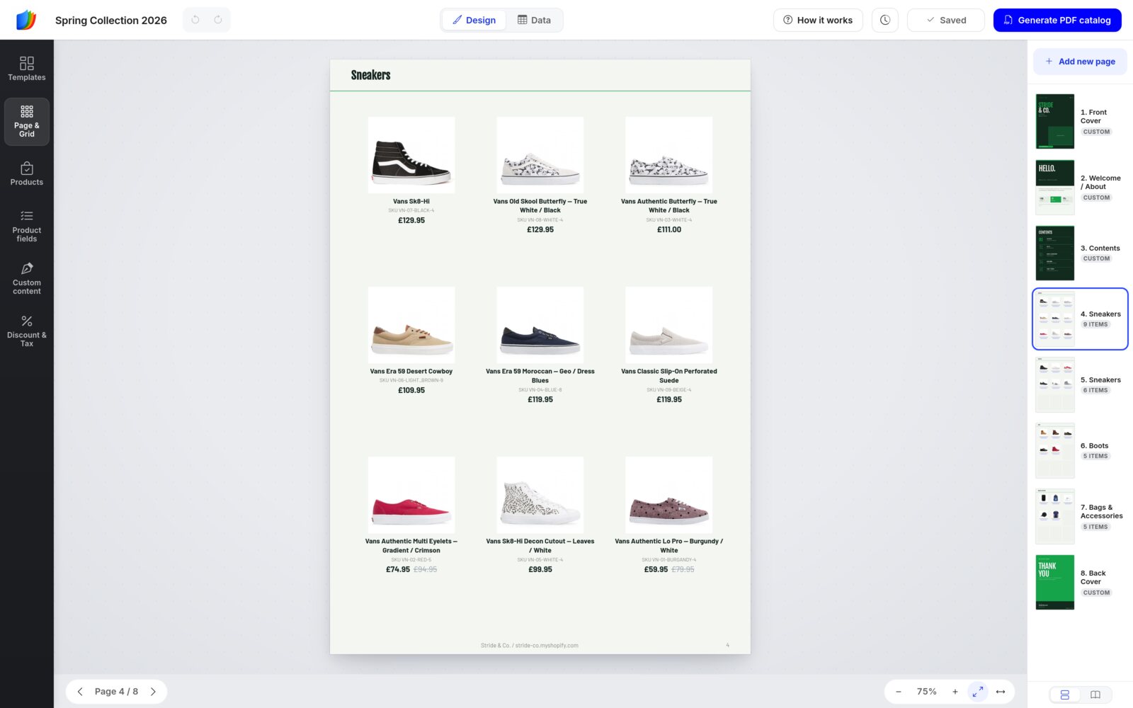
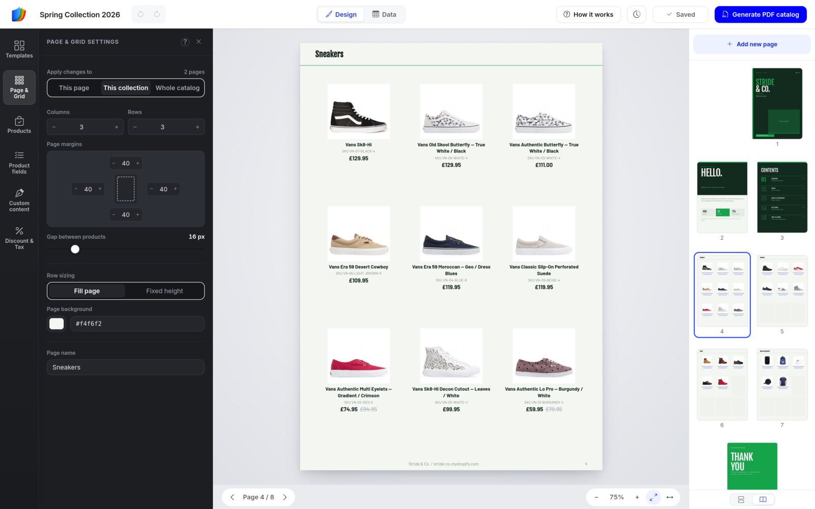
Here is the grid editor with a product page open:
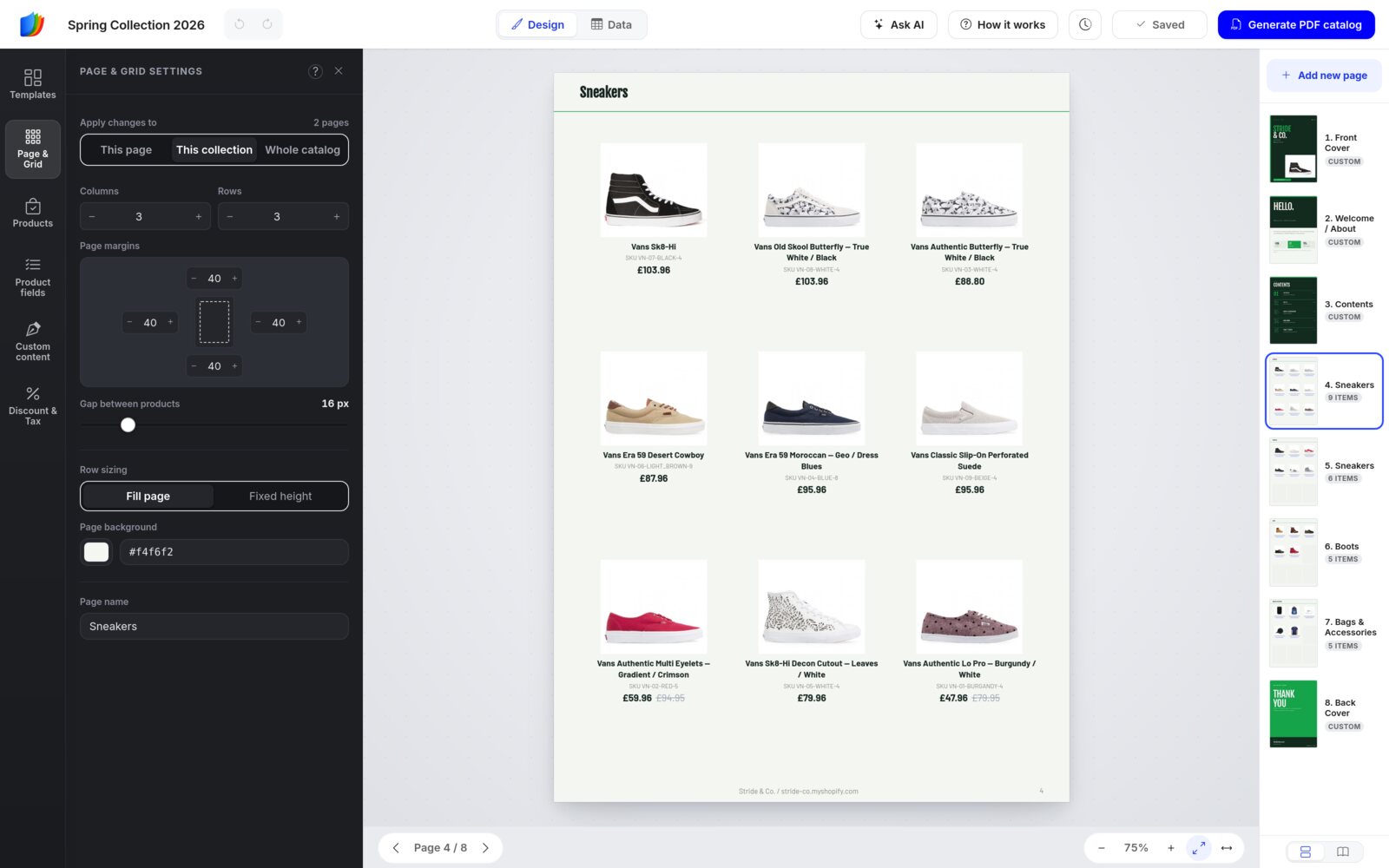
It suits anyone who sells from a product list: wholesale line sheets, seasonal lookbooks, retail catalogs and price lists. You don't need design skills. You work on the real page, exactly as it will print.
When you finish, you'll have:
- A print-ready PDF catalog, in the quality you choose.
- Share links: the PDF, a Wholesale order form and a browse-only Showcase flipbook (your catalog online, with pages that turn like a book), plus a Retail order form on Shopify stores.
- A QR code for each link, ready for print, packaging or a trade-show stand.
Shopify or not, it works the sameAccounts that aren't connected to a Shopify store add products by importing them (a CSV file, WooCommerce, Google Sheets, Airtable or Dropbox) or by typing them in. Where something differs, this guide says so.
Step 1
Start a new catalog
Every grid catalog starts from a template. It takes about a minute.
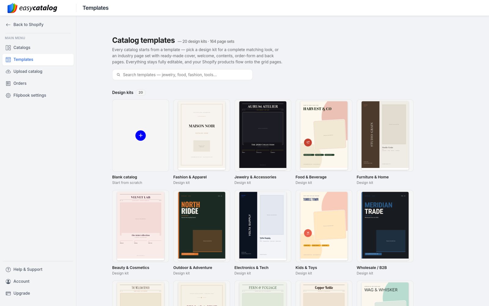
- Open Catalogs in the main menu and click New catalog (Advanced editor). Or click Templates in the same menu. Both open the template gallery.
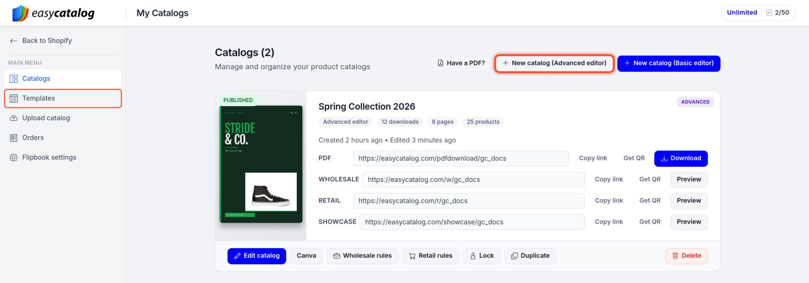
If you have no catalogs yet, the Catalogs page shows start cards instead of these buttons. On a Shopify store, click Start with Advanced. Accounts without Shopify see one card: click Create a catalog. Once you have catalogs, accounts without Shopify see a single New catalog button.
- Pick a starting point. Blank catalog gives you product pages only. A design kit, such as Fashion & Apparel or Sports & Fitness, adds a matching cover, welcome page, contents page and back cover. Further down the page you'll find 164 industry page sets. Type in the search box to filter them.
- Set up the catalog in the Start with a template window:
- Design kits (left): switch kits at any time. The previews update.
- Cover (middle): click the cover style you like.
- Content pages: Welcome / About and Contents are ticked for you. Click a page to add it, click again to leave it out.
- Product pages (further down): pick a grid, such as 3 × 3, and how many product pages to start with. More pages are added for you when you import products.
- Back cover (at the bottom): keep it or leave it out.
- Catalog name, Paper size (A4, Letter or A5) and Orientation (Portrait or Landscape) on the right.
- Check the page summary, for example 6 pages — 4 designed + 2 product, and click Create catalog. The editor opens on your first product page.
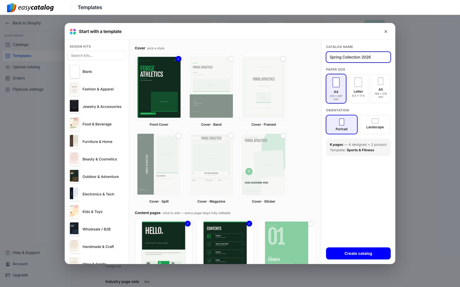
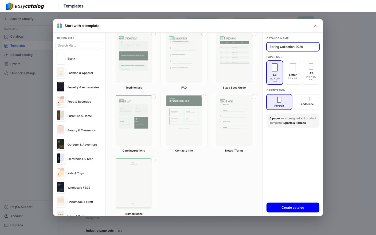
You choose the paper size and orientation here, when you create the catalog. Pick the size you plan to print or send.
Step 2
The editor at a glance
The editor has six areas. Once you know what each one is for, everything else falls into place.
Your first visit: a short guide
When you open your first grid catalog, a window called Build a catalog on the grid sums up the basics in six tips. Click Got it. I want to add products now to go straight to the product import, or I will add products later to close it. You can reopen it at any time with How it works in the top bar.
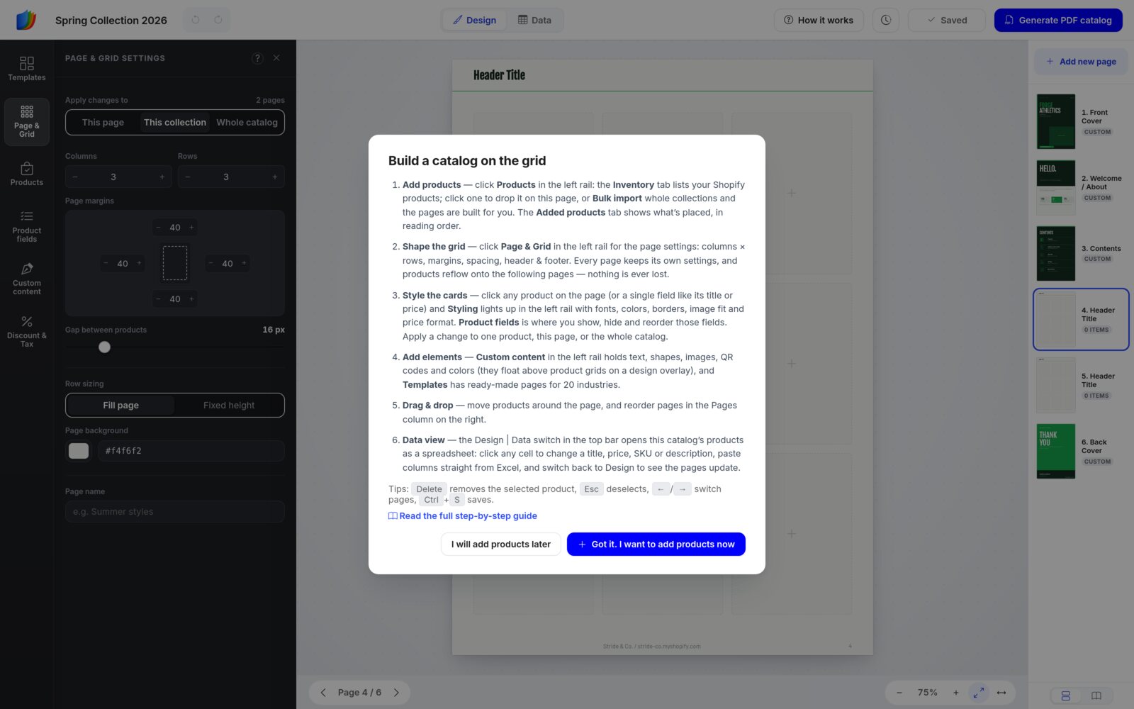
The six areas
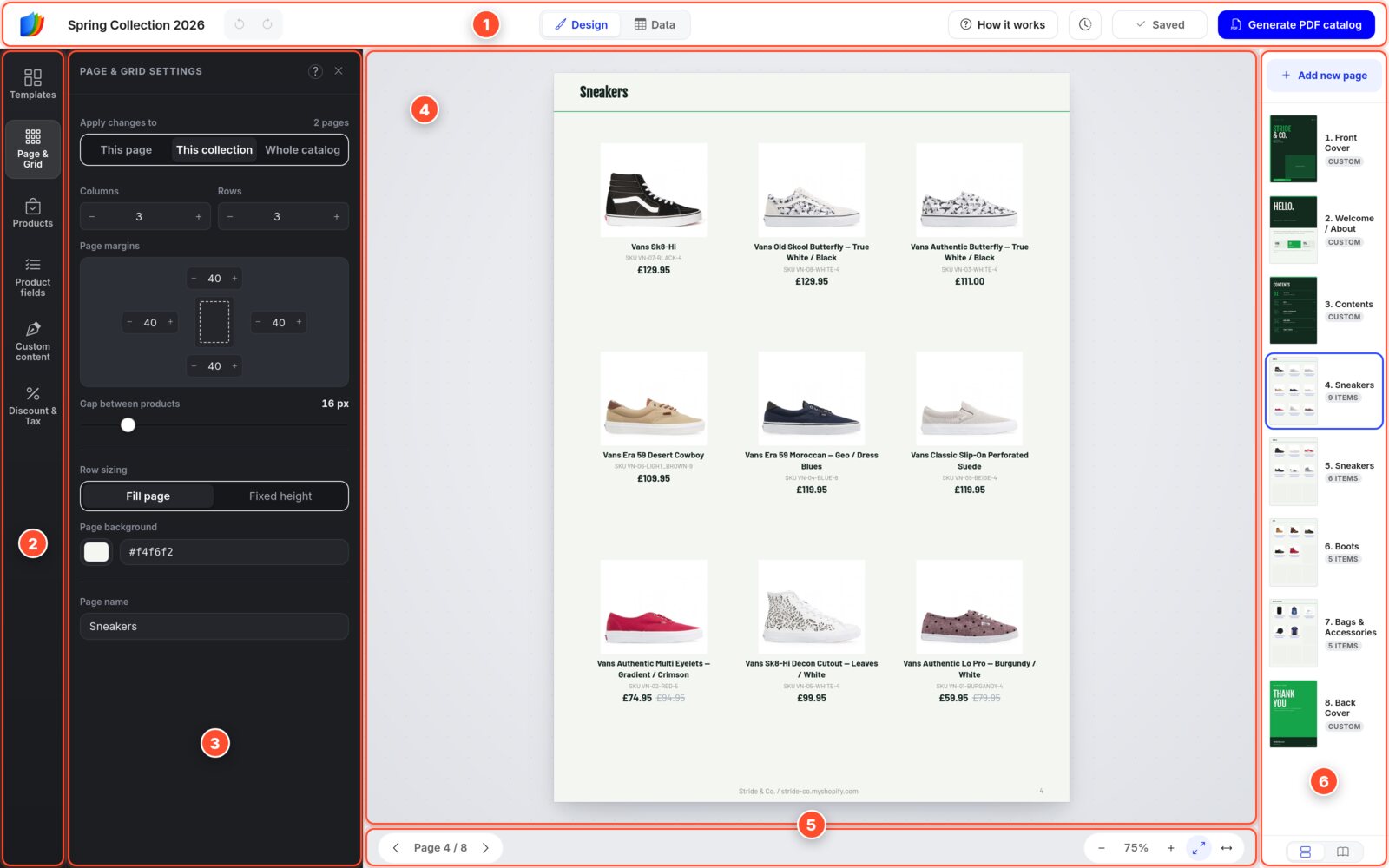
The interface map. Click an area, or a number below, to read about it. Full size
- 1Top barName, undo and redo, Design | Data, the Save button and Generate PDF.
- 2Left sidebarThe dark column of icons. Pick what you want to work on.
- 3Secondary panelThe settings for the tool, or for what you clicked.
- 4CanvasThe page itself, exactly as it will print.
- 5Page & zoom barMove between pages and zoom in or out.
- 6Pages sidebarOn the right: every page of the catalog. Open, reorder and add pages.
In short: pick a tool in the left sidebar, change it in the secondary panel, check the result on the canvas, and organize your pages in the Pages sidebar.
1 Top bar
What it's for: everything that affects the whole catalog: its name, your history, saving and the PDF.

From left to right:
- Logo: leaves the editor and takes you to the Templates page, where your catalogs are also listed.
- Catalog name: click it to rename the catalog. Enter saves the name, Esc cancels. The name shows on your Catalogs page and on the pages you share.
- Undo and Redo (the two arrows): step back and forward through your changes, anywhere in the catalog.
- Design | Data: switch between your pages and a spreadsheet of your products. See Data view.
- Ask AI: opens the AI help chat, which answers your questions with screenshots. See Ask AI.
- How it works: reopens the short guide.
- Clock: opens Version history.
- Save button: reads Saved, Unsaved (amber) or Saving…. Click it to save.
- Generate PDF catalog: creates the PDF and your share links. See step 10.
2 Left sidebar
What it's for: choosing what you want to work on. The left sidebar is the dark column of icons on the far left. Click an icon, and its tools open in the secondary panel next to it.
| Icon | Use it to |
|---|---|
| Templates | Add ready-made pages: product grids, mosaic layouts, blank canvases and designed pages from your kit. |
| Page & Grid | Set the layout of the current page: columns and rows, margins, spacing, background and page name. |
| Products | Add products from your store and manage the ones already placed. |
| Product fields | Choose what every product card shows: image, title, SKU, price and more. |
| Custom content | Add text, shapes, badges, images, QR codes and color palettes. |
| Discount & Tax | Print discounted or tax-free prices, or convert them with a multiplier. |
| Styling | Appears at the bottom of the left sidebar only while a product card, or one of its fields, is selected. |
| Selected | Appears while a text, shape or image is selected. It takes that element's type as its name, such as Text or Image. |
The editor opens with Page & Grid active. Click the icon that is already open to fold the panel away, and click it again to bring it back.
3 Secondary panel
What it's for: showing the settings for one thing at a time, like Canva. Its title tells you what you're working on.
The panel has two looks, and the color tells you which one you're in:
Templates, Page & Grid, Products, Product fields, Custom content and Discount & Tax. Use it to add things or set up a page.
Styling, Header area, Footer area and the selected text, shape or image. The title reads, for example, Styling: Title.
- The small ? icons: hover the question mark next to a heading for a short explanation.
- X: slides the panel away to give the page more room. Clicking the active icon in the left sidebar does the same.
- To bring the panel back, click any icon in the left sidebar or anything on the page.
One rule for the layout and styling panels: Apply changes to
Page & Grid, Product fields, the header and footer, and Styling start with Apply changes to. Pick it first, then change the setting. It decides which pages the change reaches:
| Choice | The change reaches |
|---|---|
| This page | Only the page you're on. |
| This collection | Every page from the same collection. In the sample, that's both Sneakers pages. |
| Whole catalog | Every product page in the catalog. |
The small count on the right, such as 2 pages, tells you how much the change will touch. Styling offers This product / This page / Whole catalog instead. Discount & Tax works the other way round: set the numbers first, then click an Apply to button.
4 Canvas
What it's for: the page itself, exactly as it will print. You edit right on it.
- Click a product to style the whole card. Styling opens in the panel.
- Click one field, such as the title or price, to style just that field.
- Click the header or footer band to edit its text and look.
- Click an empty + cell to choose where the next product goes. See Add products one by one.
- Drag a product onto another cell to move it.
- To remove a product, click it and press Delete, or hover it and click the small × on its card. The message that appears offers Undo.
- On design pages, click a text, shape or image to edit it, and double-click text to type.
- Press Esc to deselect.
5 Page & zoom bar
What it's for: moving between pages and changing how big the page looks. Zoom never changes the printed size.
- ‹ Page 4 / 8 ›: previous and next page.
- − 75% +: zoom out and in.
- Fit the whole page (diagonal arrows): shows the full page.
- Fit to width (side arrows): larger text on laptops. Scroll down for the rest of the page.
6 Pages sidebar (right)
What it's for: seeing and organizing every page of the catalog.
- Each page shows as a thumbnail with its number, name and type. CUSTOM marks a design page, such as a cover or welcome page. 9 ITEMS marks a product page holding 9 products.
- Click a page to open it. Drag it to reorder.
- Ctrl-click (Cmd-click on a Mac) or Shift-click to select several pages and move them together.
- Hover a page to duplicate or delete it.
- Add new page opens the Templates panel. Click it again to close the panel.
- You can also drag a product from the Inventory list onto a page thumbnail to add it to that page.
- The two buttons at the bottom switch between one page per row and a two-page book view.
Keyboard shortcuts
| Keys | What it does |
|---|---|
| Ctrl + S | Save the catalog. |
| Ctrl + Z | Undo. |
| Ctrl + Shift + Z | Redo. |
| Delete | Remove the selected product, or the selected text, shape or image. |
| Esc | Deselect. |
| ← / → | Previous or next page, when nothing is selected. |
| Double-click text | Edit the text on a design page. |
| Ctrl-click a page | Select several pages in the Pages sidebar. |
On a Mac, use Cmd instead of Ctrl.
Step 3
Add products
Products live in the Products panel. It has two tabs: Inventory lists your store's products, and Added products lists what's already in this catalog.
Import whole collections (the fast way)
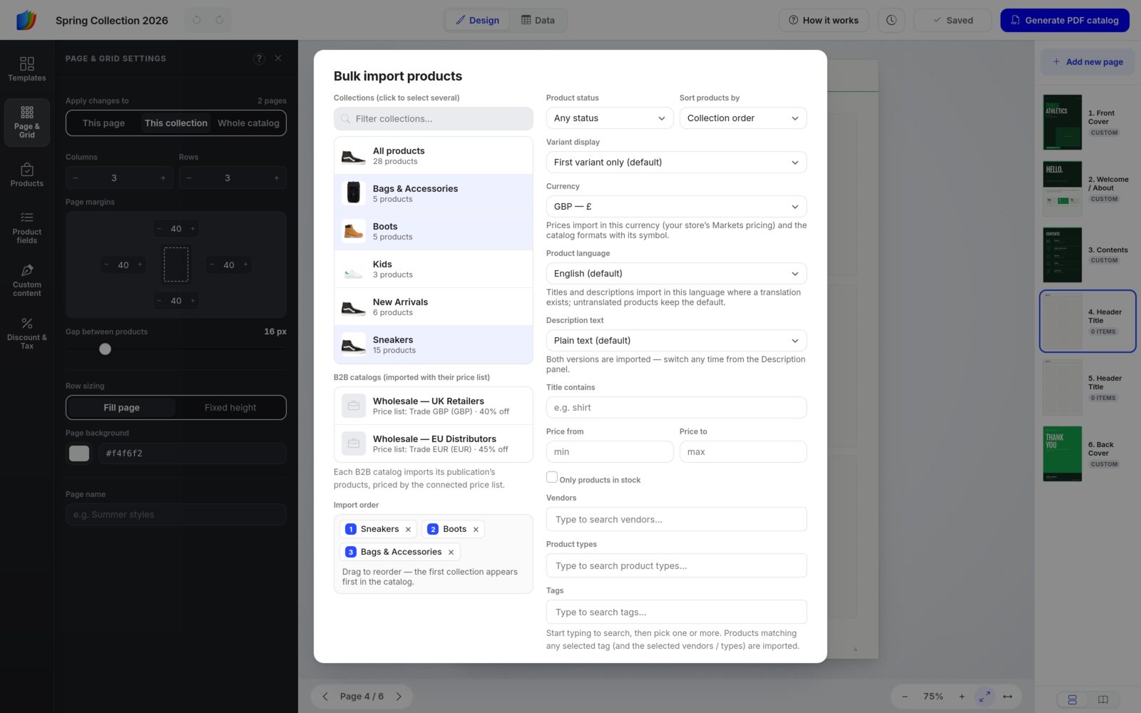
- Click Products in the left sidebar, open the Inventory tab and click Bulk import products.
- Click one or more collections. Each one becomes its own section of pages, named after the collection, with its title in the page header.
- Under Import order, drag the numbered chips. The first collection comes first in the catalog.
- Set the options on the right if you need them:
- Product status and Sort products by.
- Variant display: the first variant only, or each variant as a separate product.
- Currency (shown when your store has more than one): import prices in one of your store's Markets currencies. The catalog shows that currency's symbol.
- Product language (shown when your store has more than one): import titles and descriptions in another language, where a translation exists.
- Description text: plain text or with formatting. Both versions are imported, so you can switch later.
- Filters: Title contains, Price from / Price to, Only products in stock, Vendors, Product types and Tags.
- Click Import 3 collections (the number matches your selection).
Filter by vendor, type or tag
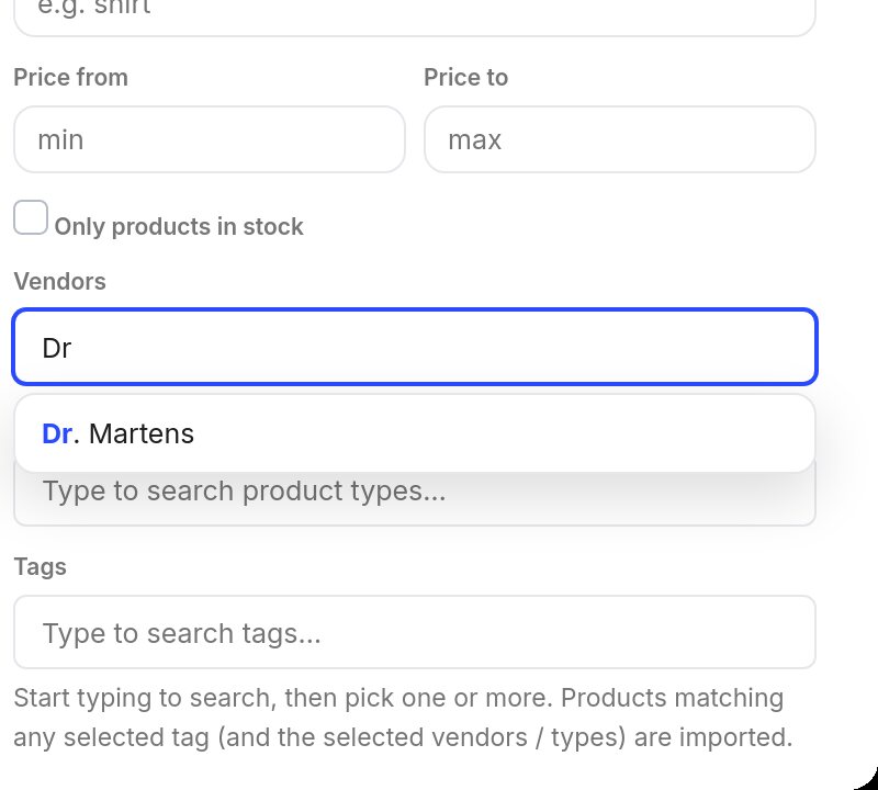
Start typing in Vendors, Product types or Tags, and pick from what your store actually uses. You can pick more than one.
If you pick several tags, a product needs only one of them. If you also pick vendors or product types, it must match those too.
B2B catalogs
On the Unlimited and Enterprise plans, B2B catalogs import a Shopify B2B catalog's products priced by its price list, for example Trade GBP · 40% off.
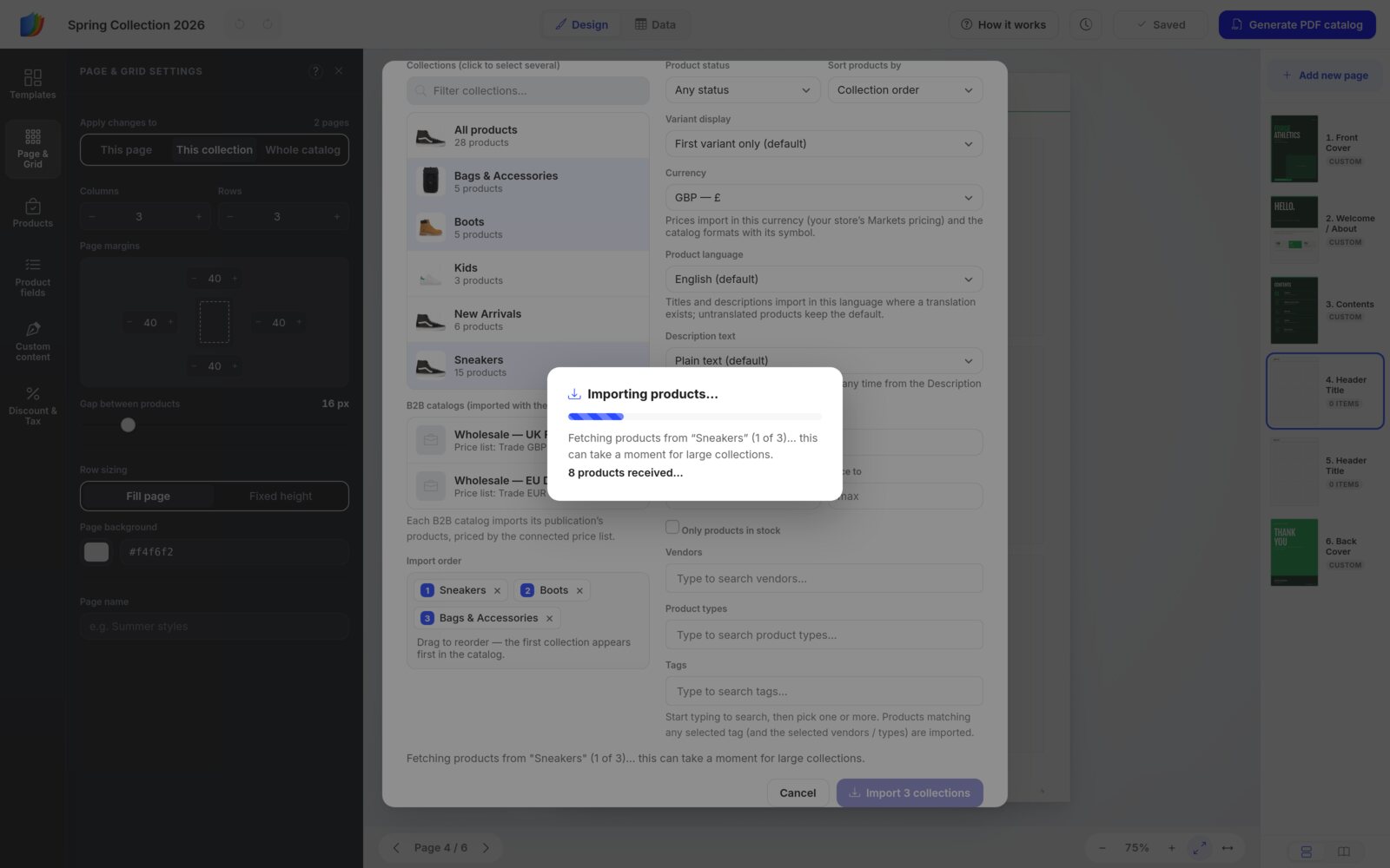
The import runs one collection at a time. A progress box shows which collection it's on and how many products have arrived.
When the import finishes, you land on the last imported page, and a message sums up what was added.
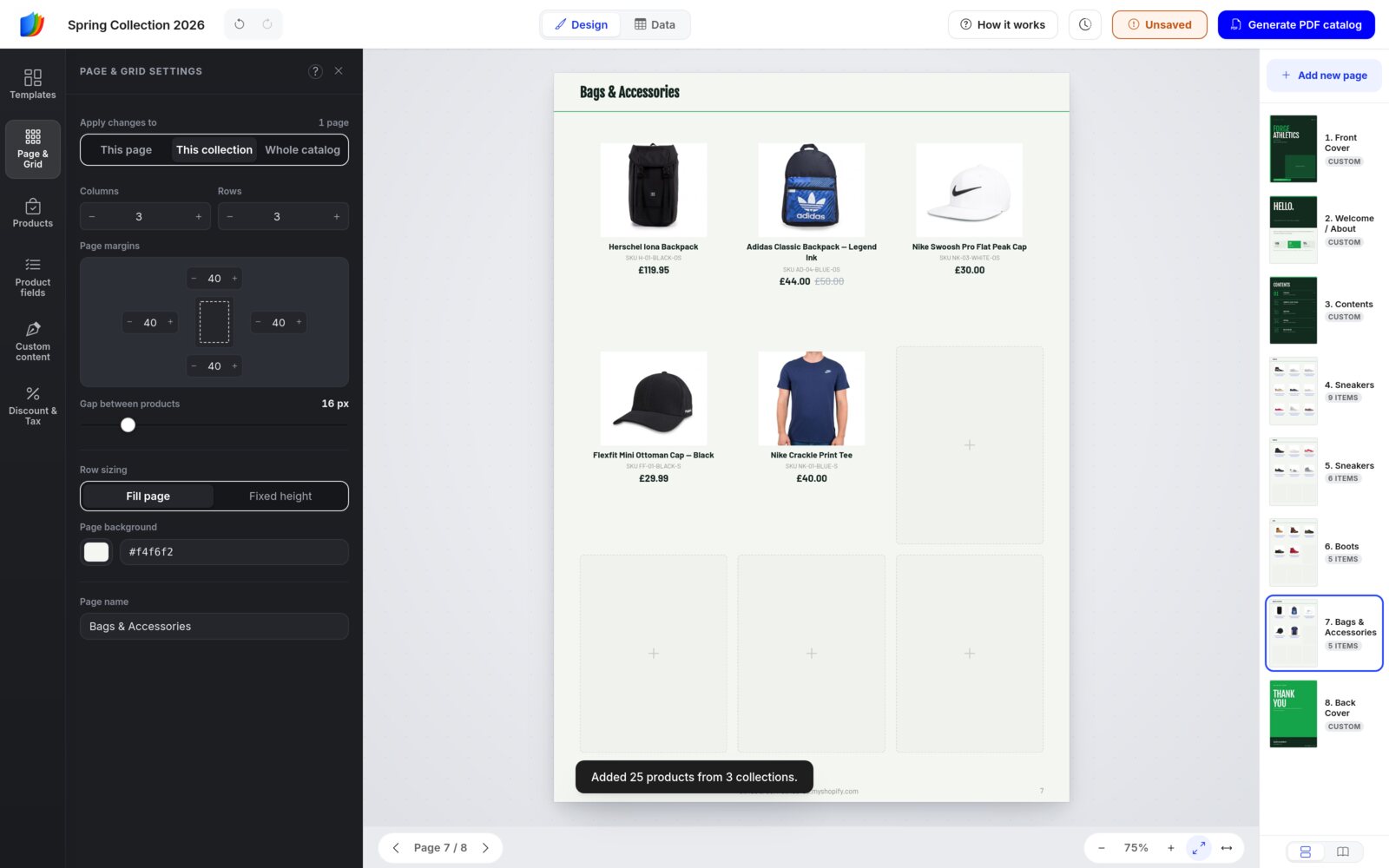
Save after importingNothing is kept until you click Save or press Ctrl + S. If you import a collection that's already in the catalog, its pages are updated instead of added again.
Add products one by one
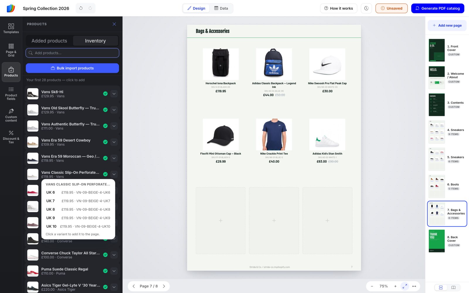
The Inventory tab lists your products. A green check means a product is already in this catalog. Type at least two letters in Add products… to search. The list starts with your first 50 products; click Load 50 more products at the bottom for more.
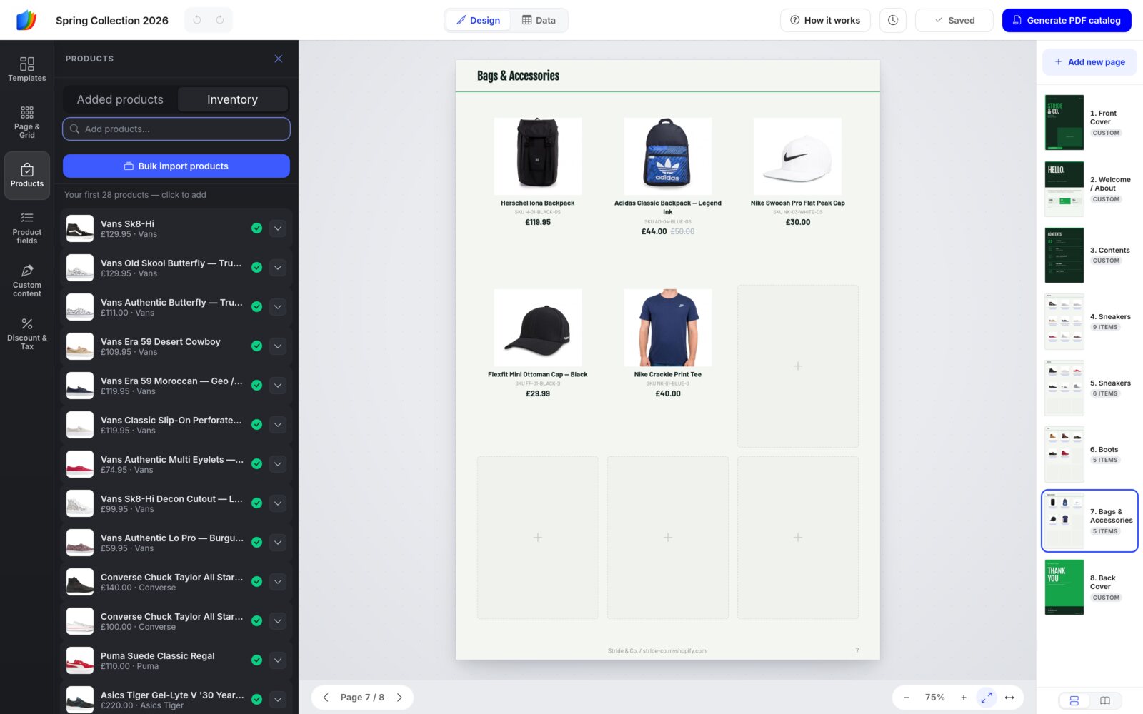
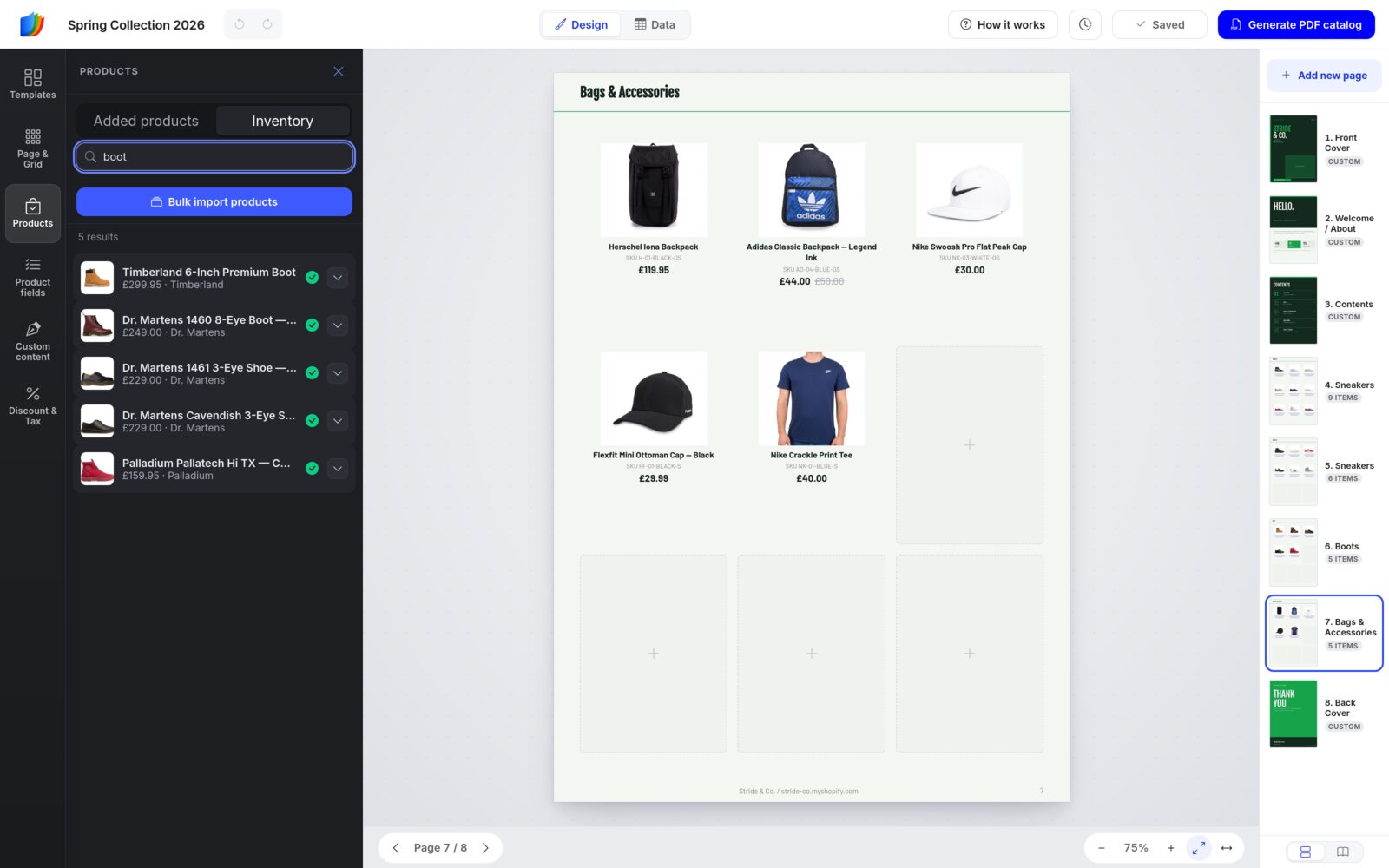
How clicking works:
- Click a product to add it at the start of the current page. The other products move along one cell, and any that no longer fit flow onto the next page.
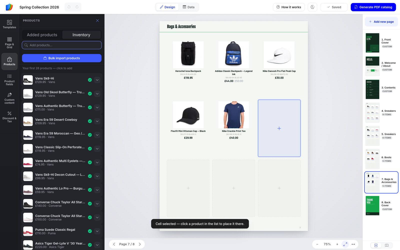
- To choose the exact spot, click an empty + cell on the page first. It gets a blue frame, and the Inventory opens. The next product you click lands in that cell.
- You can also drag a product from the list onto any cell.
- To add one size or color, click the small arrow at the end of the row and pick the variant.
Manage what's in the catalog
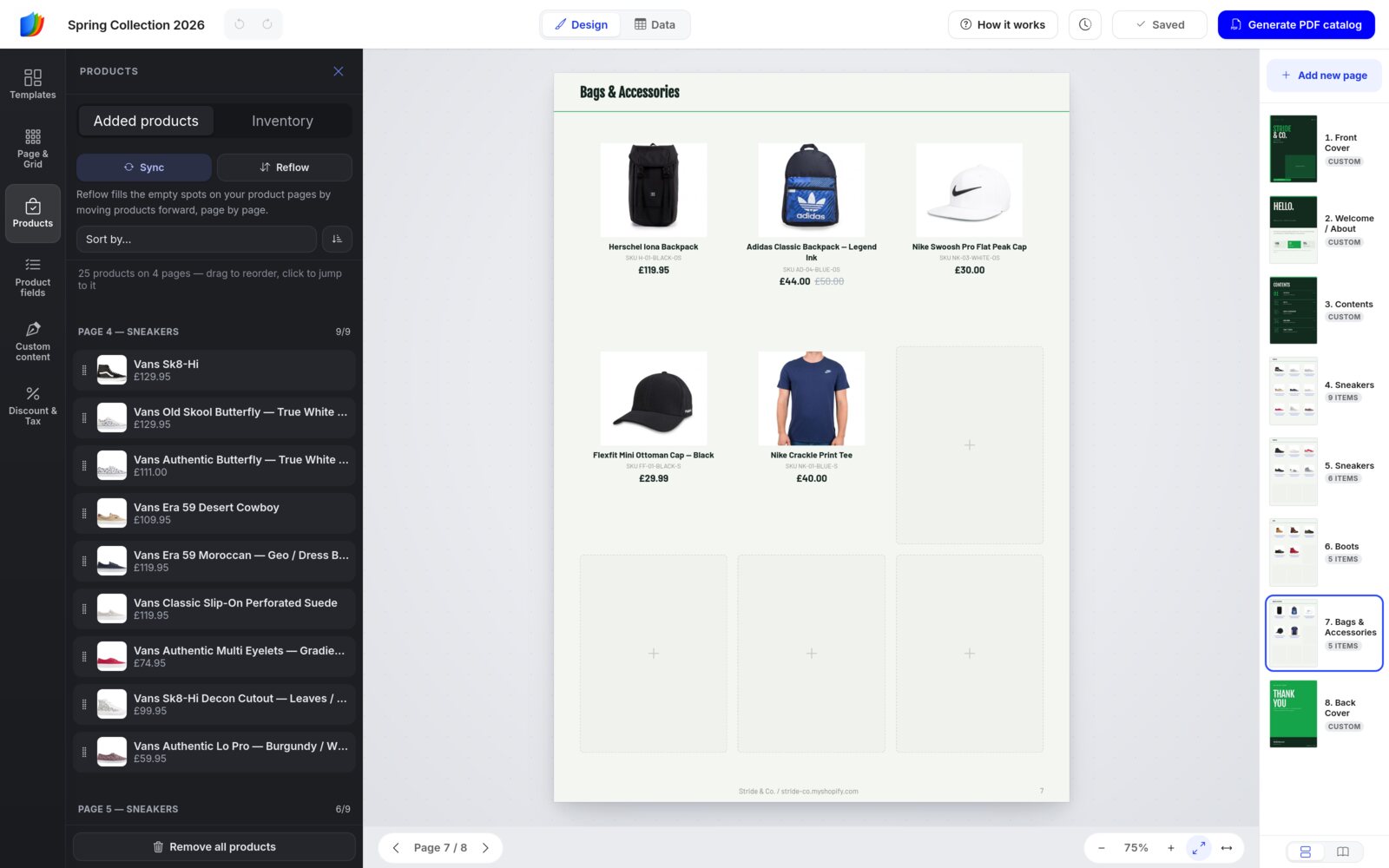
The Added products tab lists every placed product in reading order, grouped by page. PAGE 4 — SNEAKERS 9/9 means 9 products fill the 9 cells of page 4.
- Click a row to jump to that product on its page.
- Drag a row to move the product through the catalog.
- Sort by… reorders products by Title, SKU, Price, Stock, Vendor, Product type or Date created.
- Sync refreshes titles, prices and images from your Shopify store.
- Reflow fills empty spots on your product pages by moving products forward, page by page.
- The × on a row removes that product from its page.
- Remove all products takes every product out of this catalog. Your store is not affected.
No Shopify store?The Products panel lists your own inventory. Instead of Bulk import products, you'll see Import (a CSV file, WooCommerce, Google Sheets, Airtable or Dropbox), Add manually, Add all (every inventory product that isn't in the catalog yet) and Inventory, which opens your inventory spreadsheet. Clicking a product, picking an empty cell first and dragging all work the same way.
Step 4
Arrange pages and layout
Page & Grid: the layout of a product page
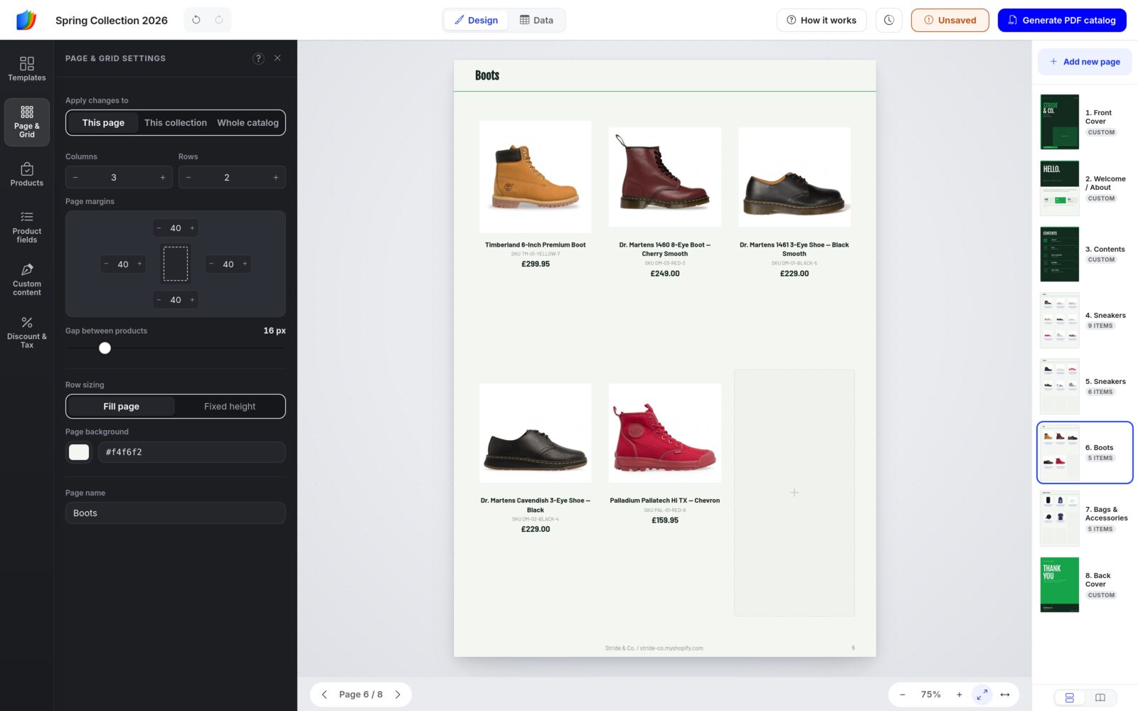
Click Page & Grid in the left sidebar. It's also the panel you see when the editor opens. Set Apply changes to first (how it works).
The settings
- Columns and Rows: how many products fit on the page.
- Page margins: the space around the edges.
- Gap between products: the space between cells.
- Row sizing: Fill page stretches the rows to fill the page; Fixed height keeps them one height.
- Page background: the page color.
- Page name: the name shown in the Pages sidebar.
If a page gets fewer cells, the products that no longer fit move onto the next pages. Nothing is lost.
Add pages from Templates
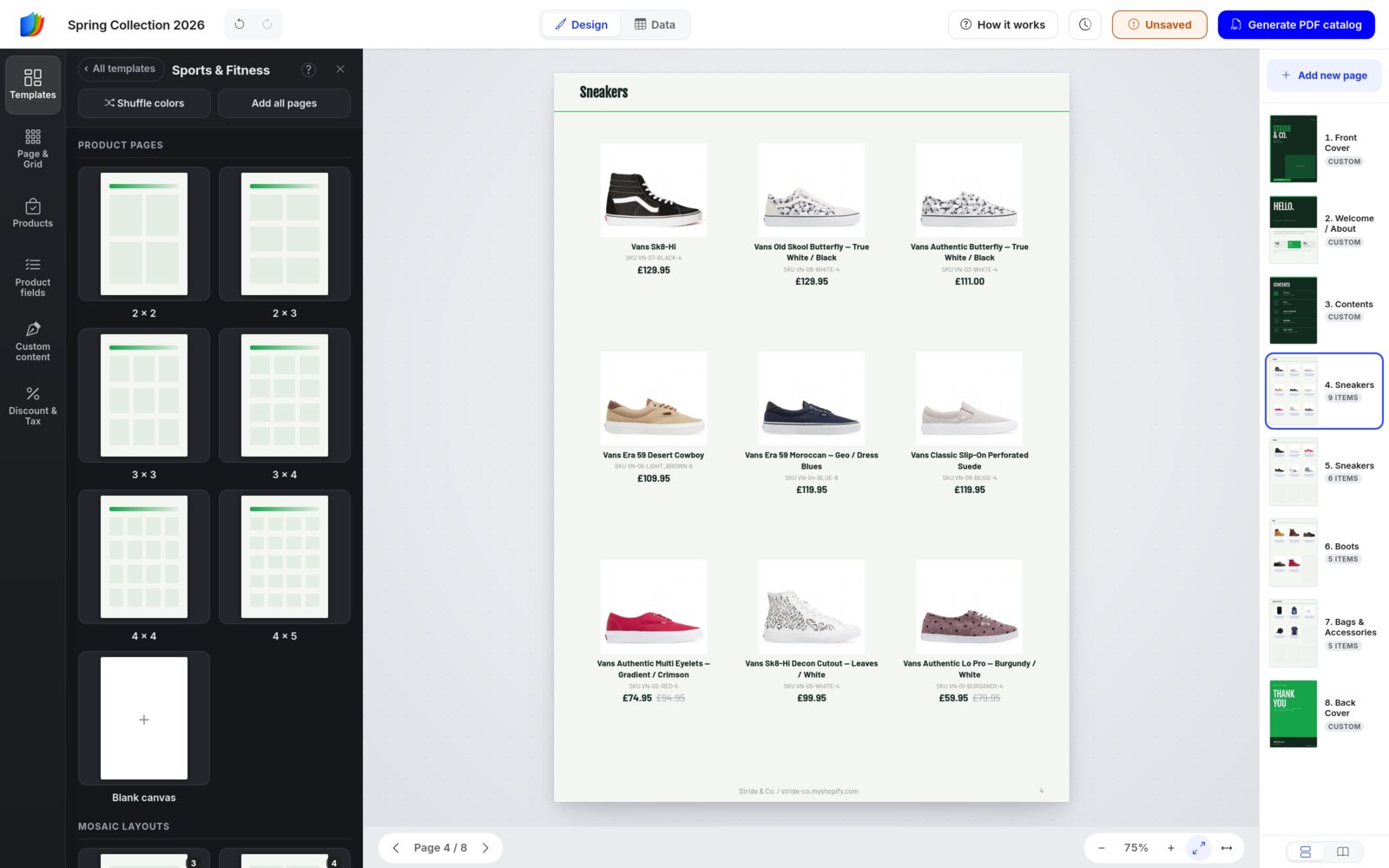
Click Templates in the left sidebar, or Add new page in the Pages sidebar. Click a tile to add that page right after the current page.
- Product pages: grids from 2 × 2 to 4 × 5, plus a Blank canvas.
- Mosaic layouts: bigger cells to feature hero products, such as Featured + 2, 1 Large + 3, Gallery 2 + 4, Mosaic, Hero + 3 and 3 + Hero.
- Content pages from your kit, further down: covers, welcome pages, dividers, promos and more.
- Add all pages adds the whole set. Shuffle colors recolors the catalog.
- ‹ All templates takes you back to browse the other design kits and the 164 industry page sets.
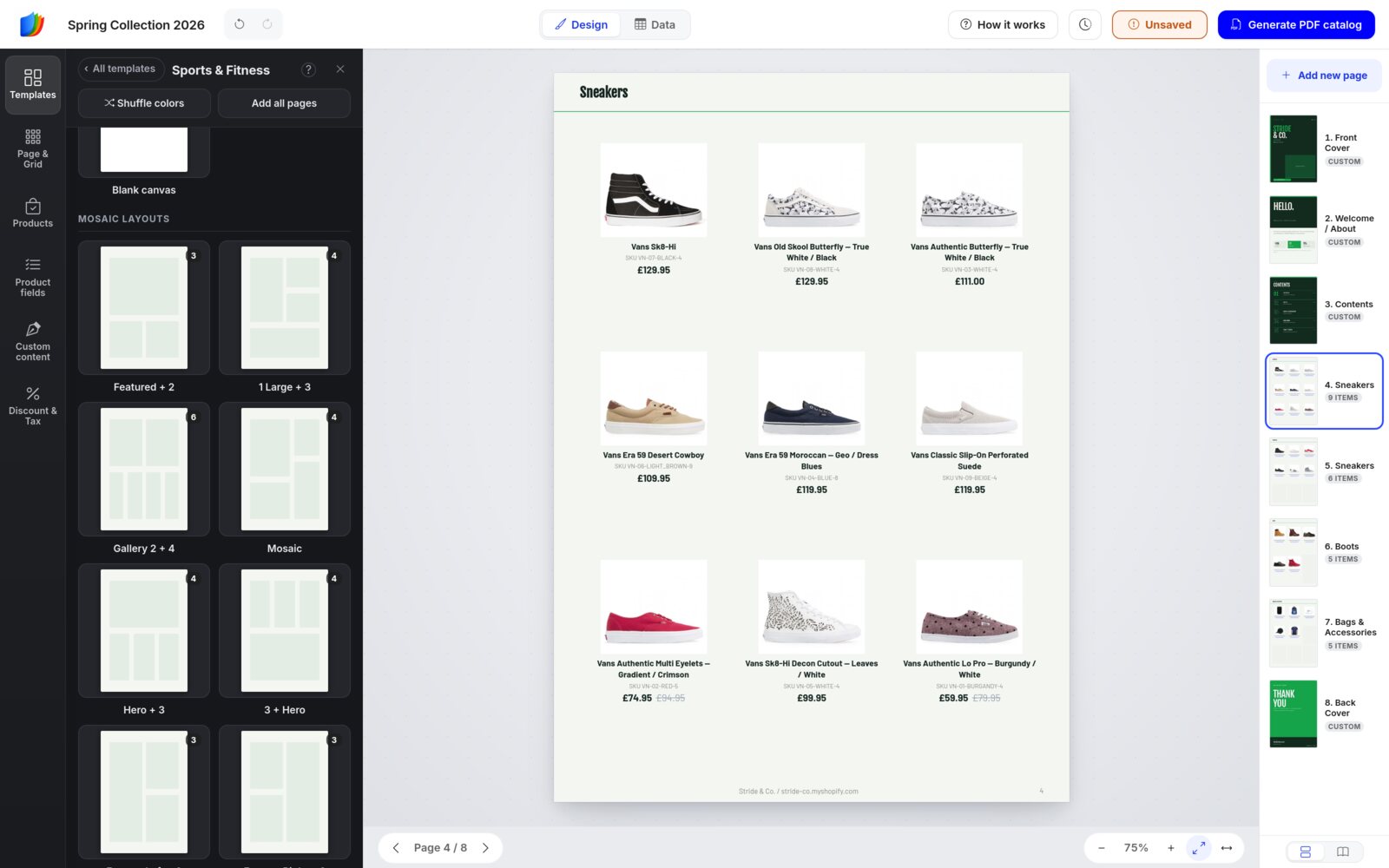
On a mosaic page, Page & Grid shows the layout's name and a Switch to uniform grid button, so you can go back to a regular grid at any time.
Reorder, copy and remove pages
Use the Pages sidebar: drag a page to move it, Ctrl-click or Shift-click to move several at once, and hover a page to duplicate or delete it.
Header and footer
Each product page has a header band at the top and a footer band at the bottom. Click the header on the page, and the white Header area panel opens:
- Show header, Height and Size.
- Text: after an import, the collection name, such as Sneakers. New pages start with Header Title. Add an optional Subheader text.
- Font, Bold / Italic, Align, Text color, Background and Divider line.
Click the footer to edit it the same way. The footer also has a Page number option. Both follow Apply changes to. The arrow at the top of the panel takes you back to Page & Grid.
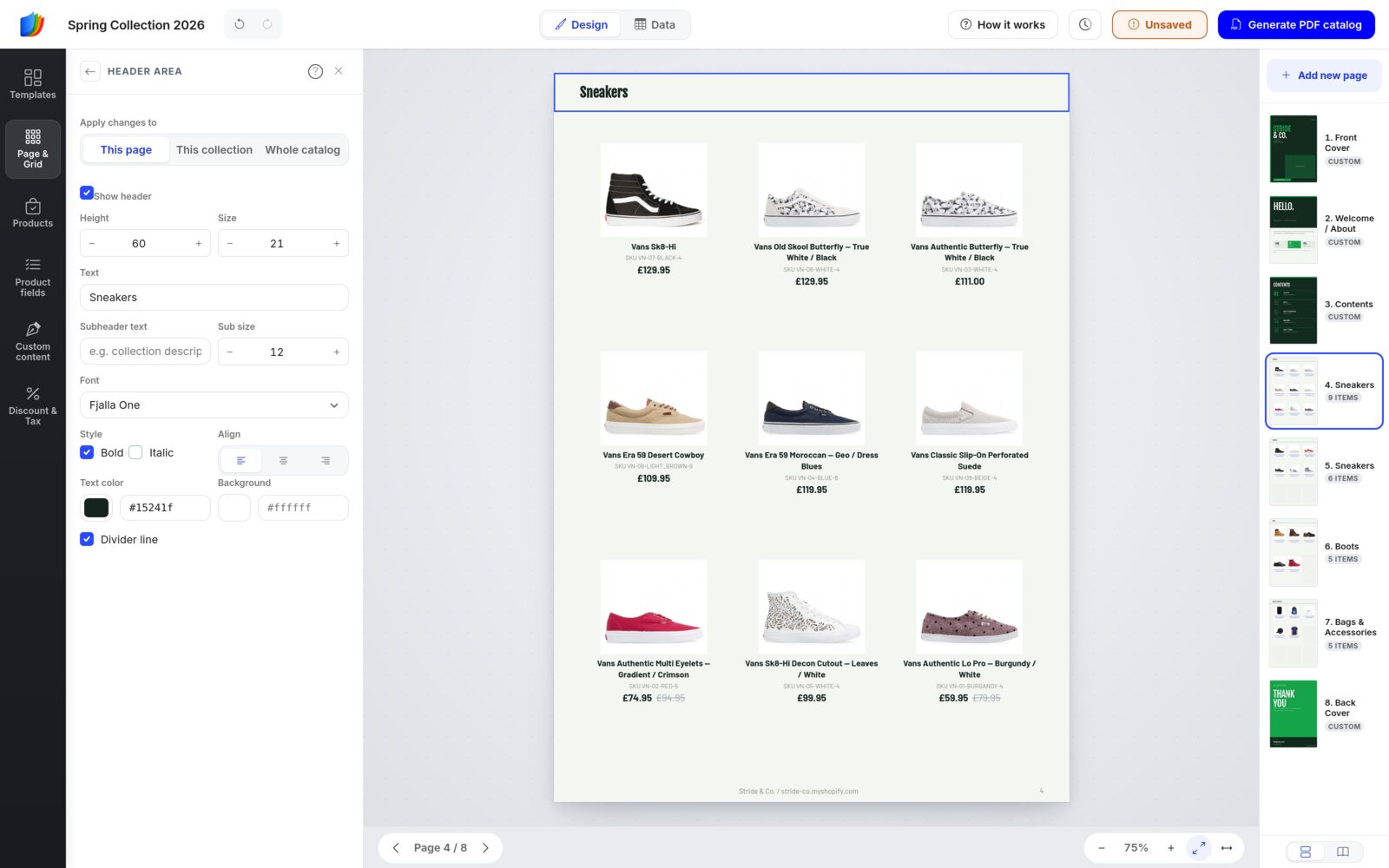
Unticked Show header by mistake? Press Undo right away to bring the header back.
Step 5
Style your product cards
Two places control the cards. Product fields decides what each card shows. Styling decides how it looks.
Choose the fields
Click Product fields in the left sidebar. Click a field to show or hide it on the cards, and drag the handle on the left to change the order. The fields include Image, Title, Variant title, Description, Vendor, SKU, Type, Tags, Options, quantities, Weight, Unit cost, Price, Discount price, Compare price, Price range, Metafields, Variant metafields, Variant table, Barcode and QR code.
Which price shows? New catalogs show the Discount price field, not Price. Until you apply a discount (step 7), it shows your normal price, with any compare-at price struck through. If you also tick Price, the cards show both.
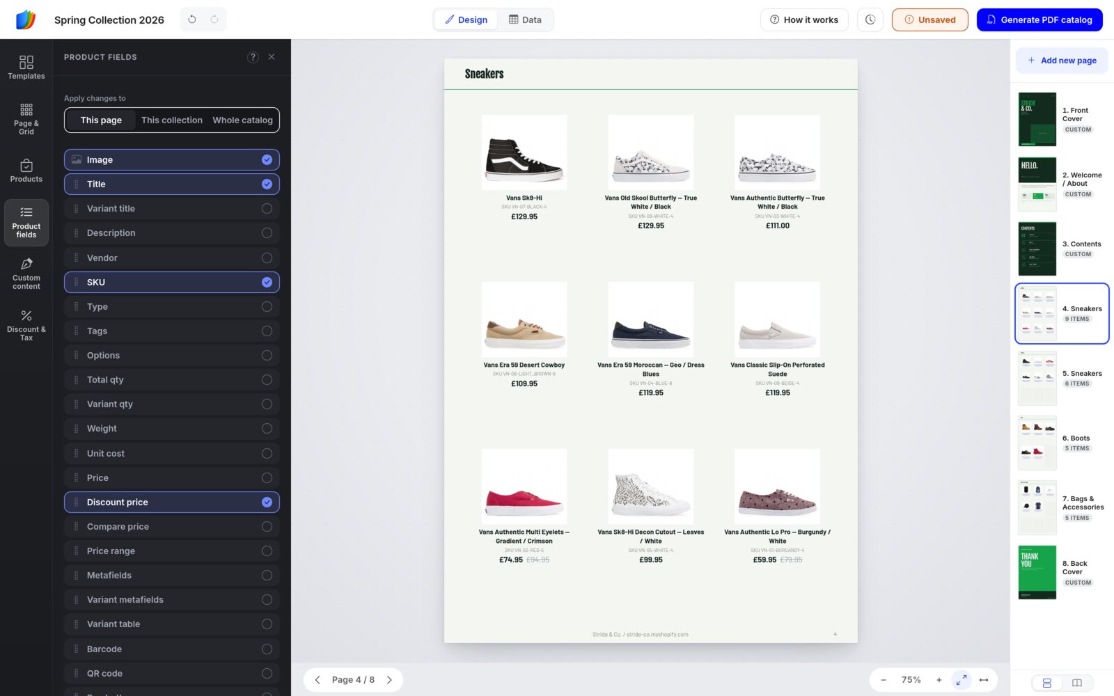
For Shopify stores, turning on Metafields (extra fields you keep on your products in Shopify) opens a dialog where you pick which metafields print on the cards and rename them.
Style the card and image
Click a product's image on the page. The white Styling: Card & image panel opens, and Styling appears at the bottom of the left sidebar.
- Apply changes to: This product, This page or Whole catalog. The count shows how many products that covers.
- Card: Layout (image above, below, left or right of the details), Image / details split, Card font, Text align and Background.
- Product image: Photos to show (1 to 6), Image size, Fit / Crop / Stretch, Corner radius and Backdrop.
- Border & spacing: the card's border (width, style and color), corner radius, padding, inner spacing and drop shadow.
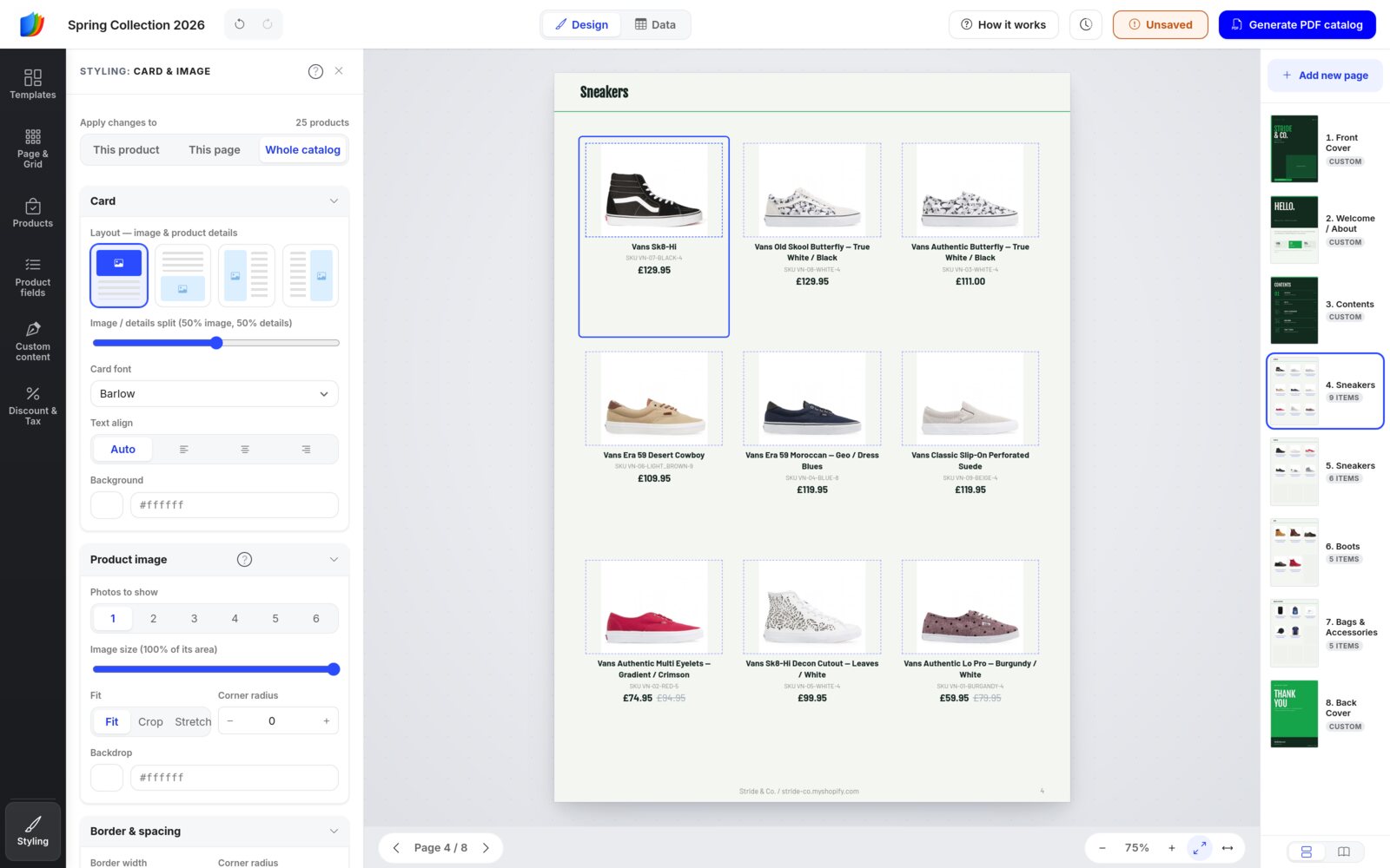
Style a single field
Click one field on a card, such as the title. The panel changes to Styling: Title and only affects that field: font, size, weight, italic and underline, alignment, text color, background, case and the maximum number of lines. Under Size & spacing, the width sets how much of the card row the field takes, so short fields can sit side by side. To change the words themselves, such as a title or a price, use Data view.
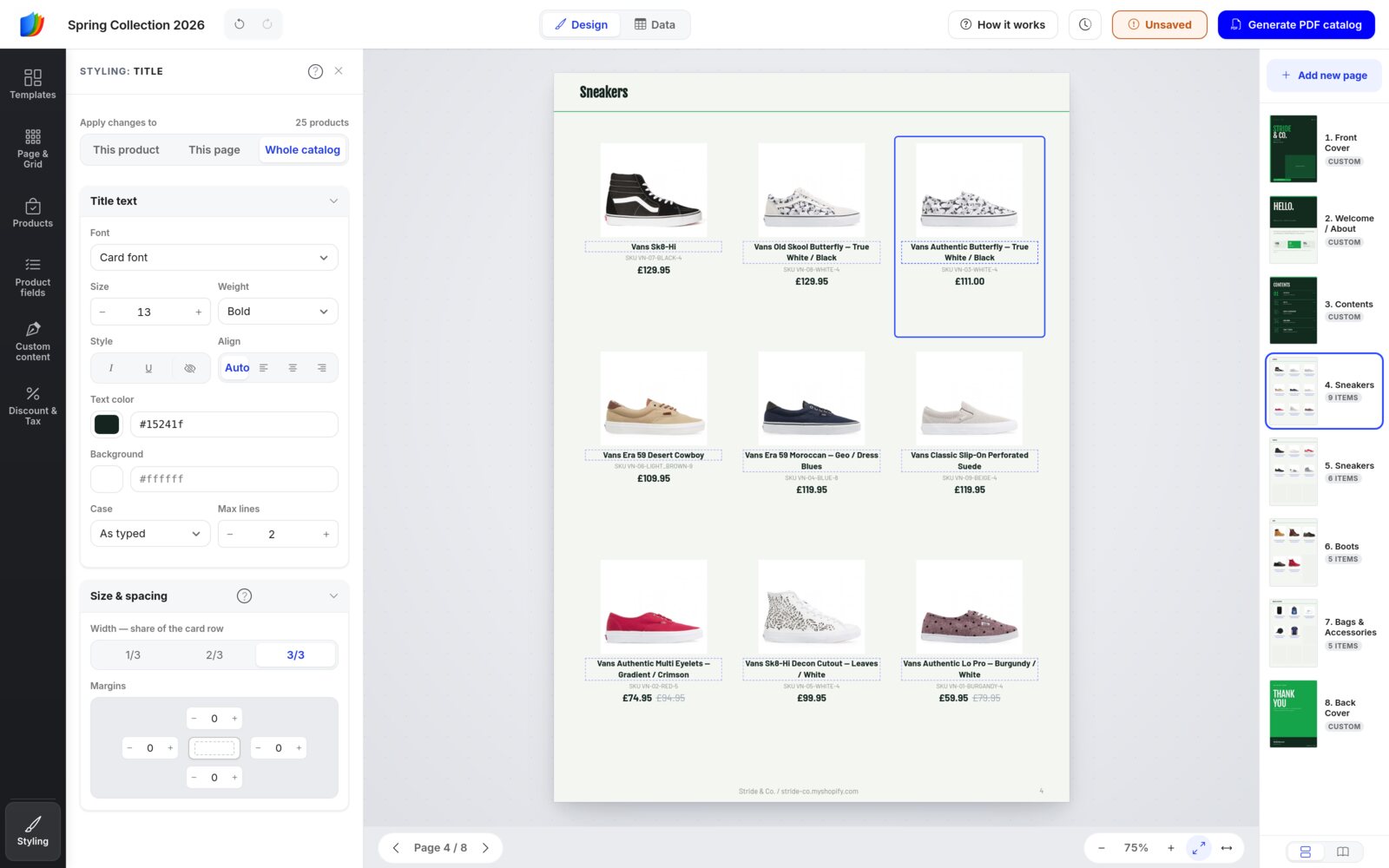
To hide a field, click the eye-slash button next to Italic and Underline. It follows Apply changes to. To show the field again, tick it in Product fields.
Format prices
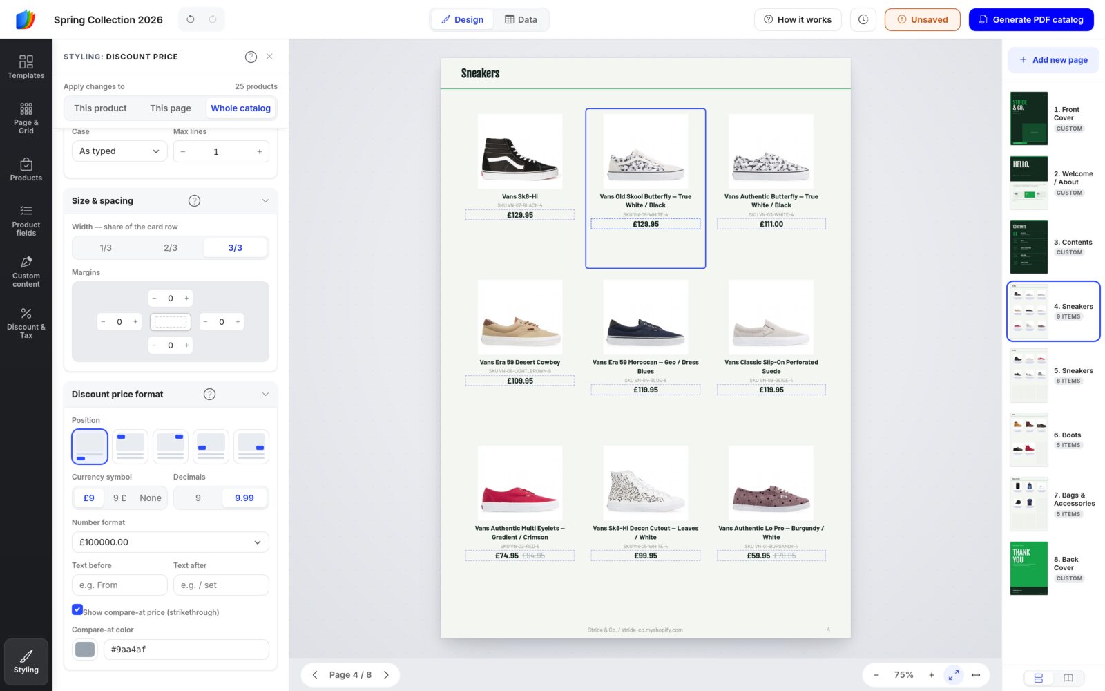
Click a price on a card. Besides the usual text settings, the panel has a price format section:
- Position: in the product details (the default), or as a badge on a corner of the photo.
- Currency symbol: before the number (£9), after it (9£) or none.
- Decimals: whole numbers (9) or two decimals (9.99).
- Number format: how thousands and decimals are written, for example 1,299.00 or 1.299,00.
- Text before and Text after: for example “From” or “/ set”.
- Show compare-at price (strikethrough) and its color.
Step 6
Design pages and custom content
Design pages (marked CUSTOM in the Pages sidebar) are free-form, like a Canva page: the cover, welcome, contents and back pages. You can also add text, shapes and images to product pages.
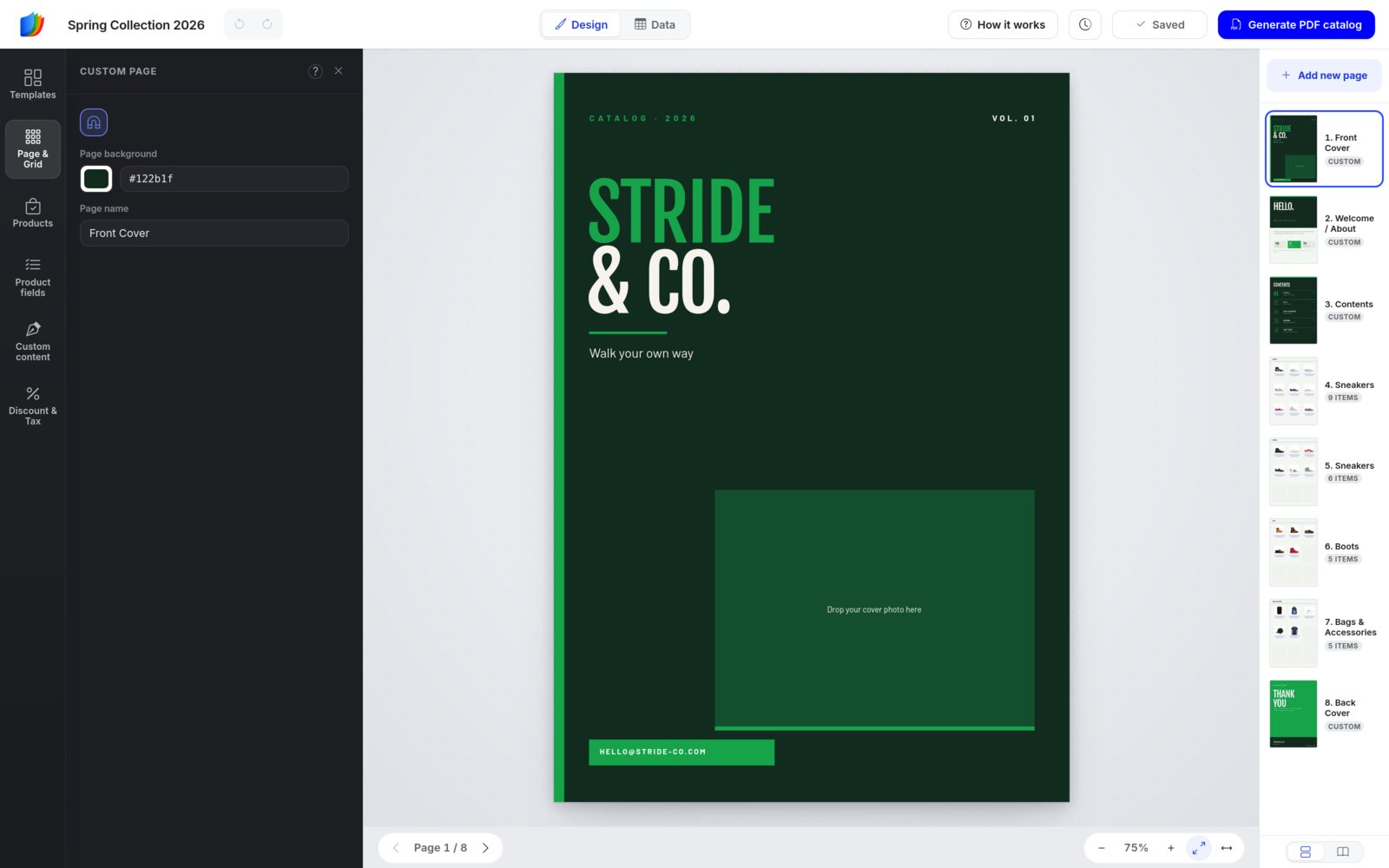
Design page settings
Open a design page with nothing selected. Page & Grid shows Custom page, with the Page background and Page name. The magnet button turns the snapping guides on and off.
Add text
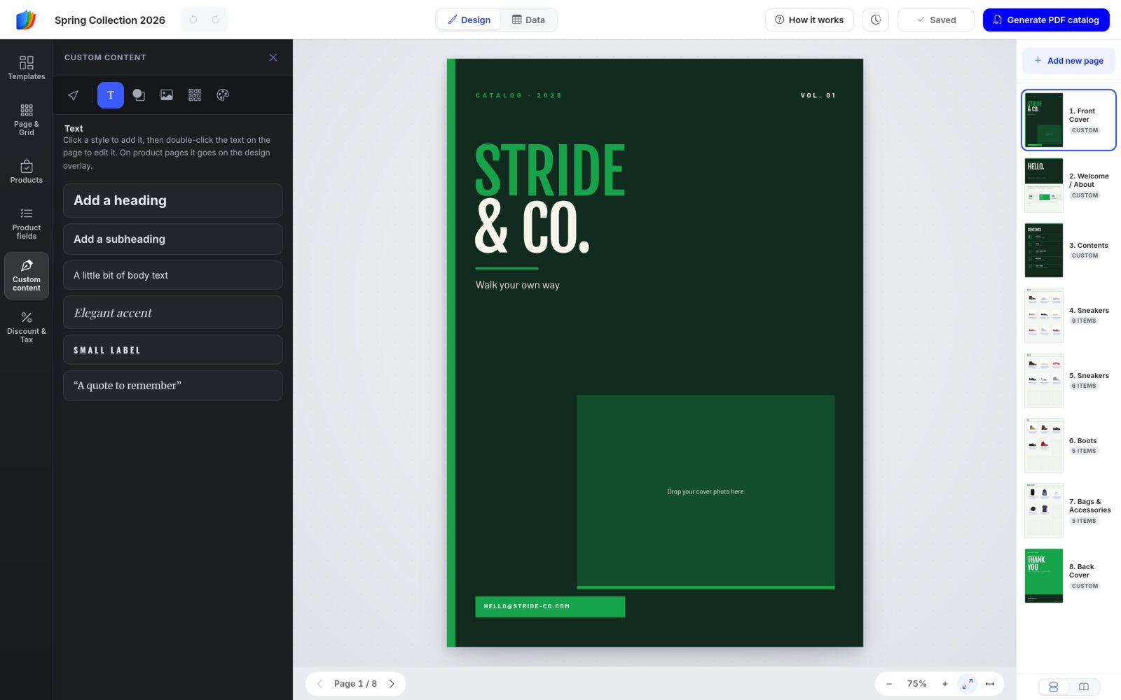
Click Custom content in the left sidebar. A row of six icons runs across the top of the panel. Hover an icon to see its name. From left to right: Select (arrow), Text (T), Shapes & lines, Images (picture), QR code and Colors (palette).
Under Text, click a style to add it: a heading, a subheading, body text, an elegant accent, a small label or a quote. Then double-click the text on the page to type.
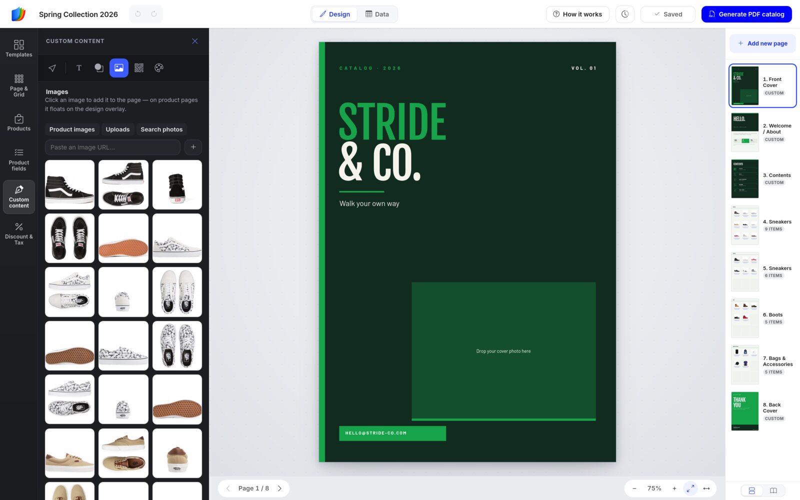
Add images
Under Images, choose from three tabs: Product images (your store's photos), Uploads (your own files) and Search photos (free stock photos). You can also paste an image address into Paste an image URL…. Click an image to add it to the page.
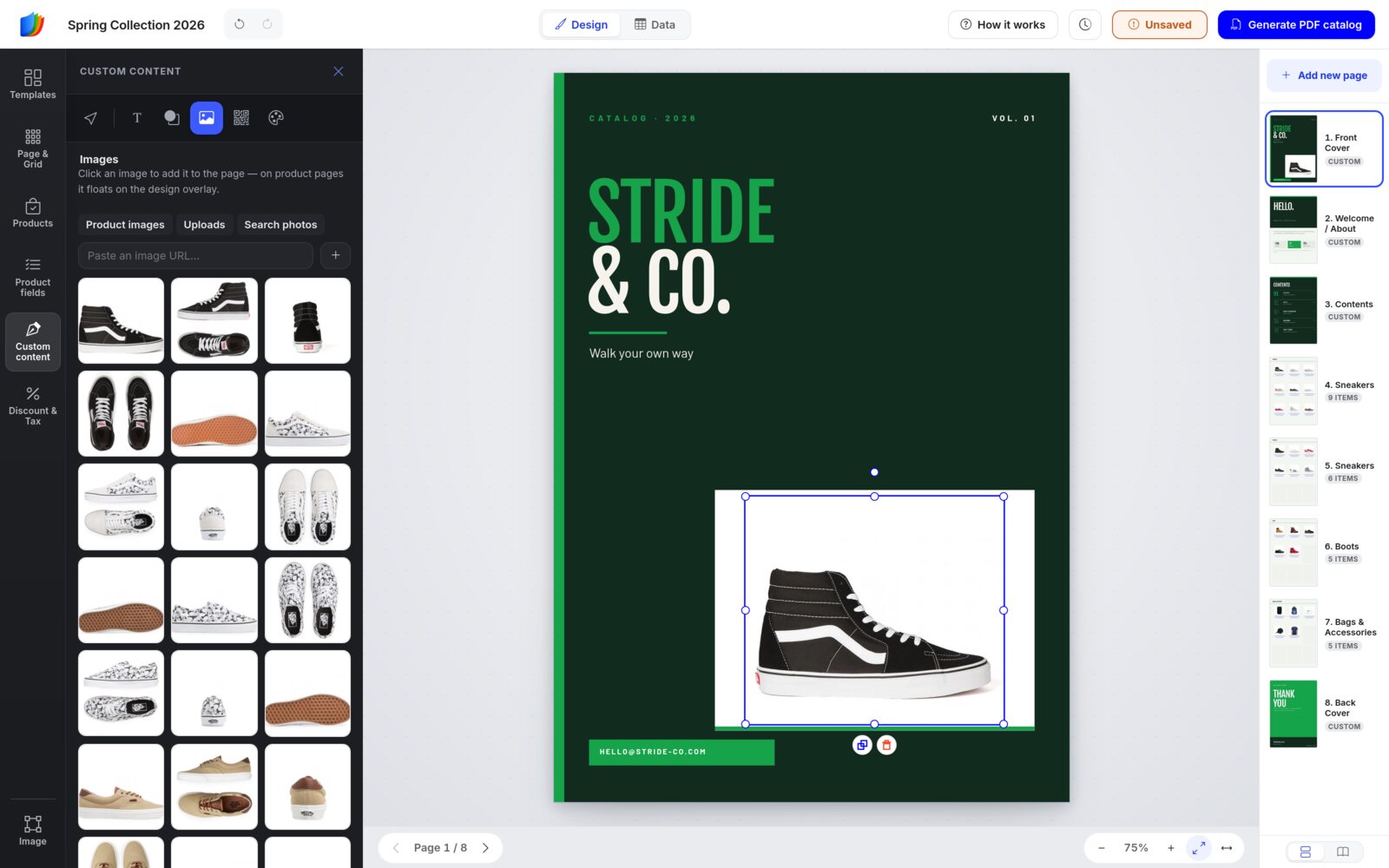
A clicked image lands in the middle of the page. On kit covers, the box that reads Drop your cover photo here is only a guide. Drag your image over it, then pull a corner handle until it fits.
Edit a selected element
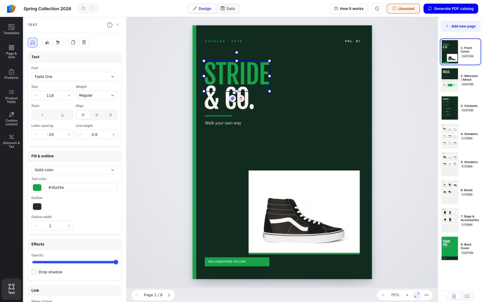
Click any text, shape or image on a design page. The white panel shows its settings, and the left sidebar shows its type, such as Text:
- Text: font, size, weight, italic and underline, alignment, letter spacing and line height.
- Fill & outline: a solid color (shapes can also take a gradient), plus an outline.
- Effects: opacity and drop shadow.
- Link: make the element clickable. It can open a web page or jump to a page of the catalog, in the flipbook and in the PDF.
- Copy to pages: copy it to All product pages, All content pages (your design pages) or All pages. Elements on a product page can also go to This collection's pages. Handy for a logo.
- Arrange: align it to the page and change the layer order.
- The buttons at the top flip, duplicate and delete it.
Right-click an element for a quick Copy to… menu.
Shapes, lines and badges
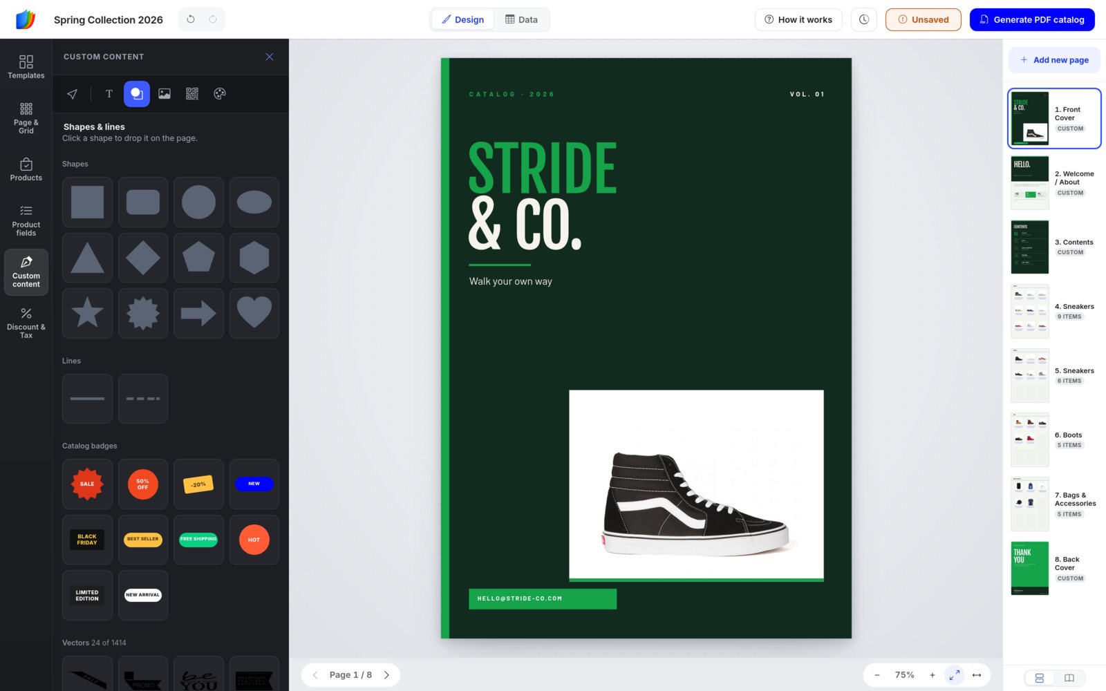
Shapes & lines has basic shapes, lines, ready-made catalog badges (SALE, 50% OFF, NEW, BEST SELLER, FREE SHIPPING and more) and a library of more than 1,400 vectors. Click one to drop it on the page.
QR codes
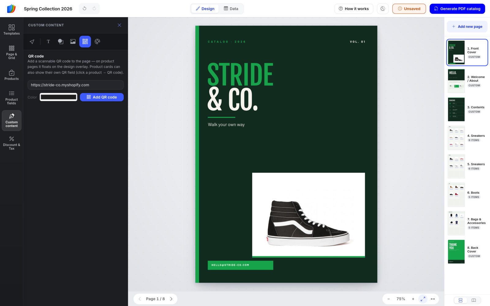
Under QR code, type any web address, pick a color and click Add QR code. Product cards can also show their own QR code: tick QR code in Product fields.
Colors and palettes
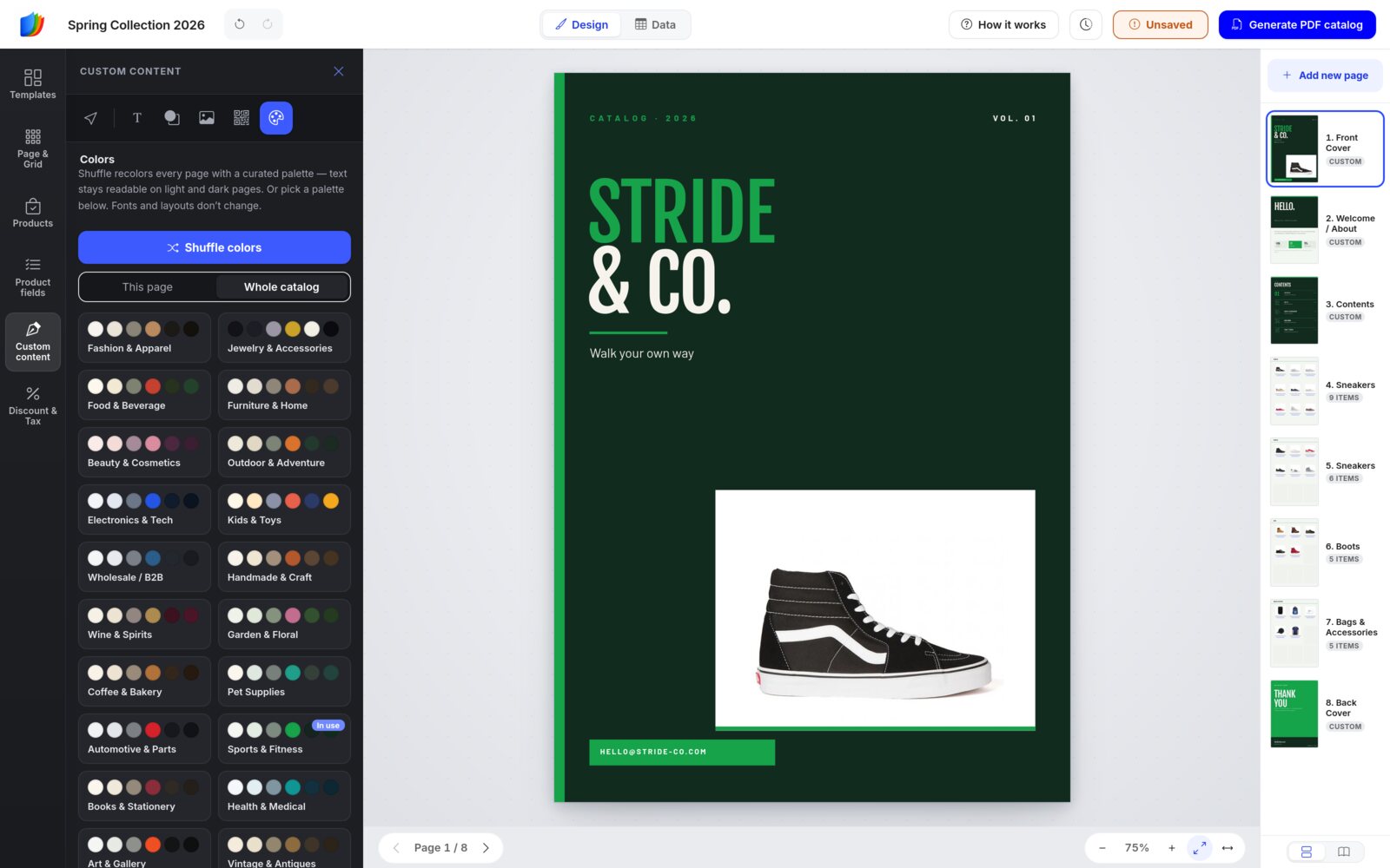
Under Colors, click Shuffle colors to recolor the catalog with a curated palette. Text stays readable on light and dark pages. Or pick a palette card. Choose This page or Whole catalog first. Fonts and layouts don't change, and the message that appears offers an Undo.
Extras on product pages
Text, shapes and images you add to a product page float on a design overlay above the grid. Use it for a SALE badge or a seasonal banner. While you edit the overlay, the product grid is locked. Click Done — back to products when you're finished.
To change an extra later, open Custom content on that page and click Design overlay, the extra button at the end of the icon row (layers icon).
Step 7
Prices: Discount & Tax
Print a trade discount, remove tax or convert prices, without touching your store.
- Open a product page and click Discount & Tax in the left sidebar.
- Under Select product, pick a product from this page to preview.
- Set Discount type (Percentage or Fixed amount) and the Discount. Add Remove tax % or a Multiplier (for example an exchange rate) if you need them.
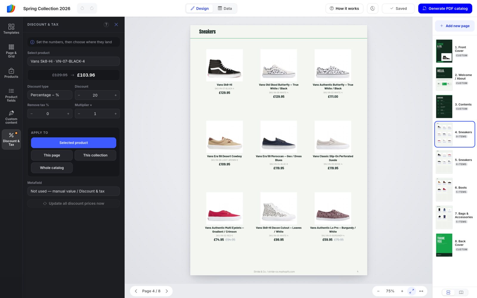
- Check the preview, for example £129.95 → £103.96.
- Under Apply to, click where the change should land: Selected product, This page, This collection or Whole catalog.
Nothing changes until you click an Apply to button. An orange dot on the Discount & Tax icon means your numbers are still waiting to be applied.
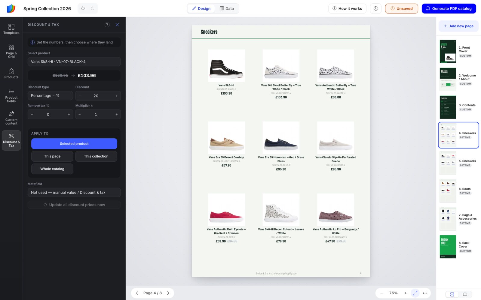
- A Discount & Tax change replaces other discount prices (typed in, from a B2B price list or from a metafield) for whatever you apply it to. To go back, set the discount to 0 and apply it again.
- The cards print the discounted price in the Discount price field, so keep it ticked in Product fields.
- Shopify stores can also take discount prices from a Metafield. Update all discount prices now reads them again.
Your store prices never changeDiscount & Tax only changes the prices printed in this catalog. The Wholesale order form uses your live store prices unless you choose Catalog discount in the Wholesale rules.
Step 8
Edit product data in Data view
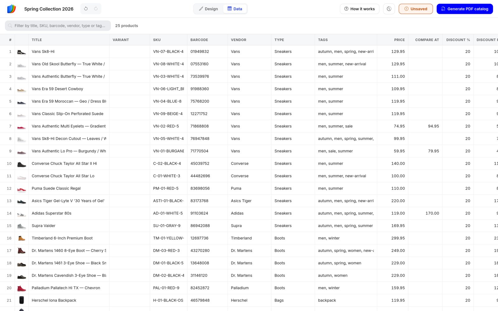
Click Data in the Design | Data switch at the top. Your catalog's products appear as a spreadsheet, one row per product.
- Click a cell to edit a title, SKU, barcode, price, discount or description. Enter, Tab and the arrow keys move between cells; Esc cancels.
- Paste whole columns from Excel or Google Sheets.
- Filter by title, SKU, barcode, vendor, type or tag, and sort by clicking a column heading.
- The On pages column tells you where each product sits.
- Edited cells get an amber marker. Your edits are kept when you Sync with Shopify.
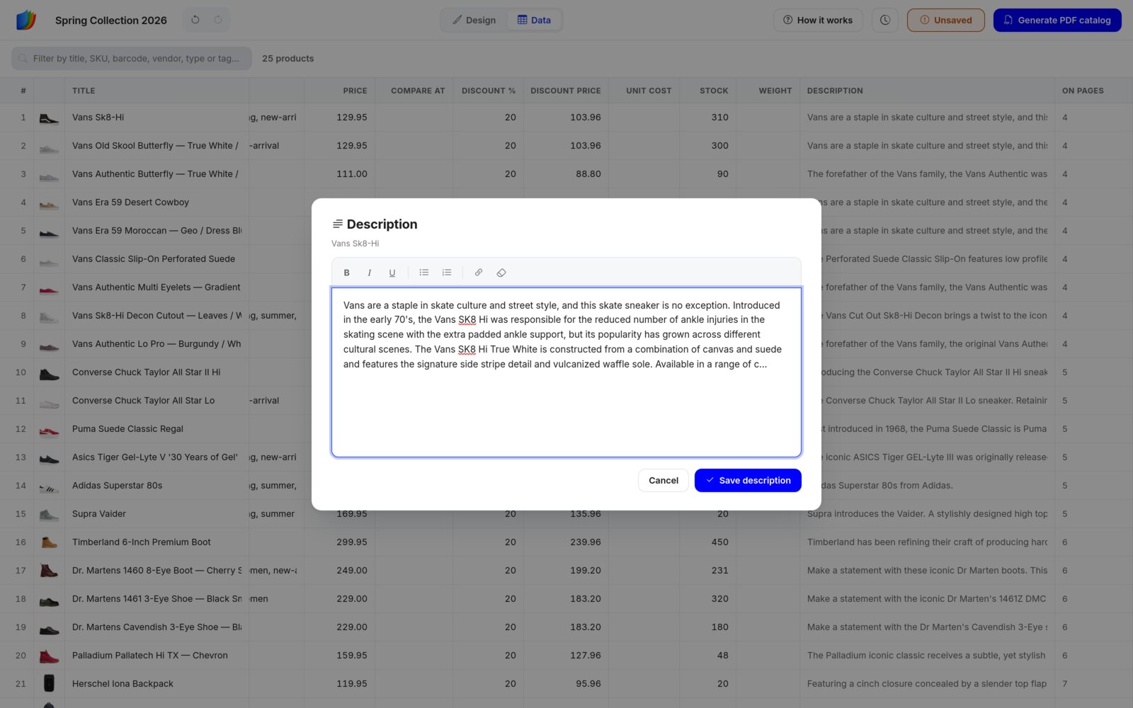
Click a Description cell to open a text editor with bold, italic, underline, lists and links. Click Save description when you're done. The formatting prints on the cards.
Switch back to Design to see the pages update.
Data view edits change this catalog only, never your store.
Step 9
Save, undo and version history
The editor does not save automaticallyClick the Save button or press Ctrl + S (Cmd + S on a Mac) whenever you want to keep your work. If you try to leave with unsaved changes, your browser warns you first.
The Save button in the top bar also shows the state of your work:
- Saved: everything is kept.
- Unsaved (amber): you have changes. Click it to save.
- Saving…: your changes are on their way.
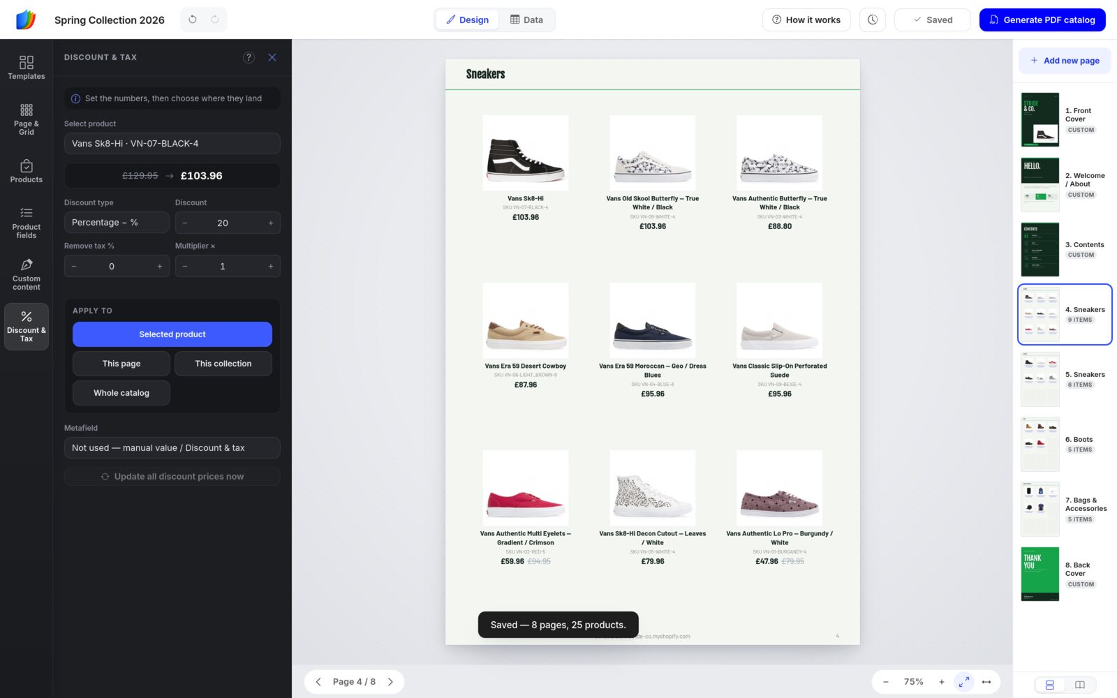
Undo and redo
The arrows next to the catalog name undo and redo changes anywhere in the catalog. If the change was on another page, the editor takes you there. The history starts fresh when you reload the editor.
Version history
Every save keeps a version. Click the clock icon in the top bar to see the 5 newest, with their age and page and product counts.
- Restore brings the catalog back to that save. You confirm first, then the editor reloads. What's saved now is kept as a version too, so you can change your mind.
- The trash icon deletes a version.
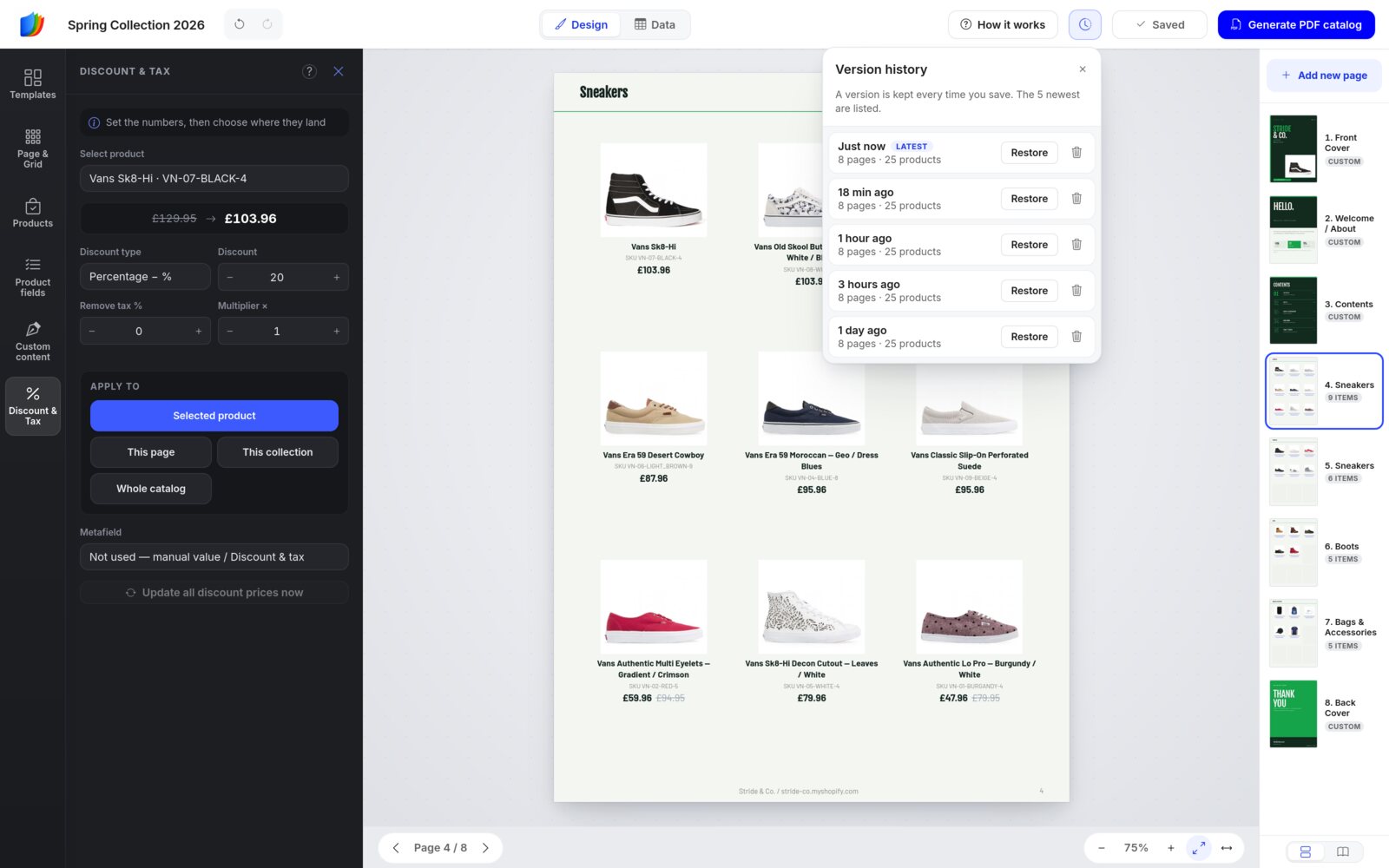
Step 10
Generate the PDF
- Click Generate PDF catalog in the top bar.
- Check the Catalog name. It is the name on your Catalogs page and on the pages you share.
- Pick a Print quality (see the table below).
- Click Generate PDF. The editor saves your work and takes you to the Catalogs page while the PDF is made.
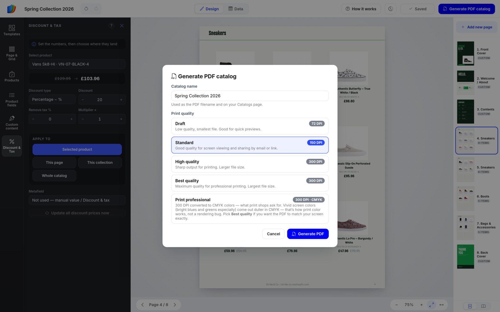
DPI (dots per inch) sets how sharp images print. Higher means sharper and a bigger file.
| Quality | Resolution | Best for |
|---|---|---|
| Draft | 72 DPI | Quick previews. The smallest file. |
| Standard | 150 DPI | Viewing on screen and sharing by email or link. |
| High quality | 300 DPI | Printing. Sharper, with a larger file. |
| Best quality | 300 DPI | Professional printing. The largest file. |
| Print professional | 300 DPI · CMYK | Print shops that ask for CMYK. Bright screen colors, especially blues and greens, look duller in CMYK. Pick Best quality if the PDF should match your screen. |
On free plans, the PDF includes a small EasyCatalog watermark.
Step 11
Share your catalog
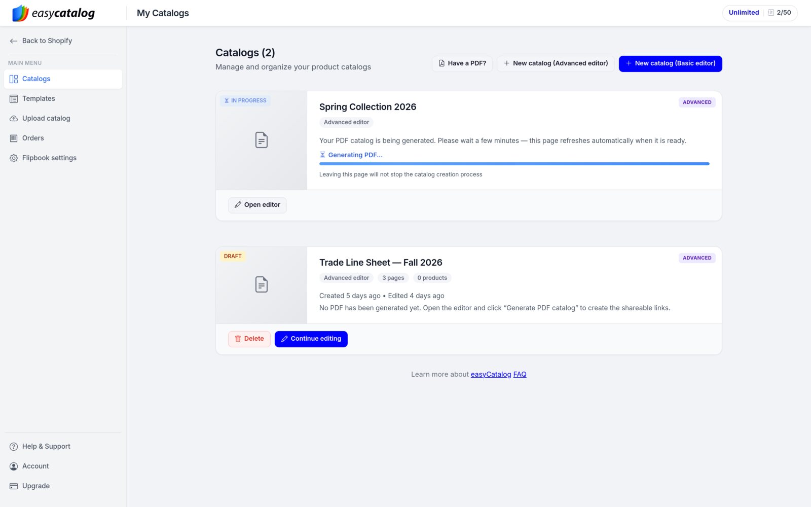
Your catalog's card on the Catalogs page shows In progress while the PDF is made. The page refreshes by itself when it's ready. You can leave the page; the work carries on.
When the PDF is ready, the card switches to Published and shows your share links: four on a Shopify store, three without Shopify (there is no Retail link). Each has Copy link, Get QR (opens a QR code image for the link in a new tab) and Preview. The PDF row has Download instead of Preview.
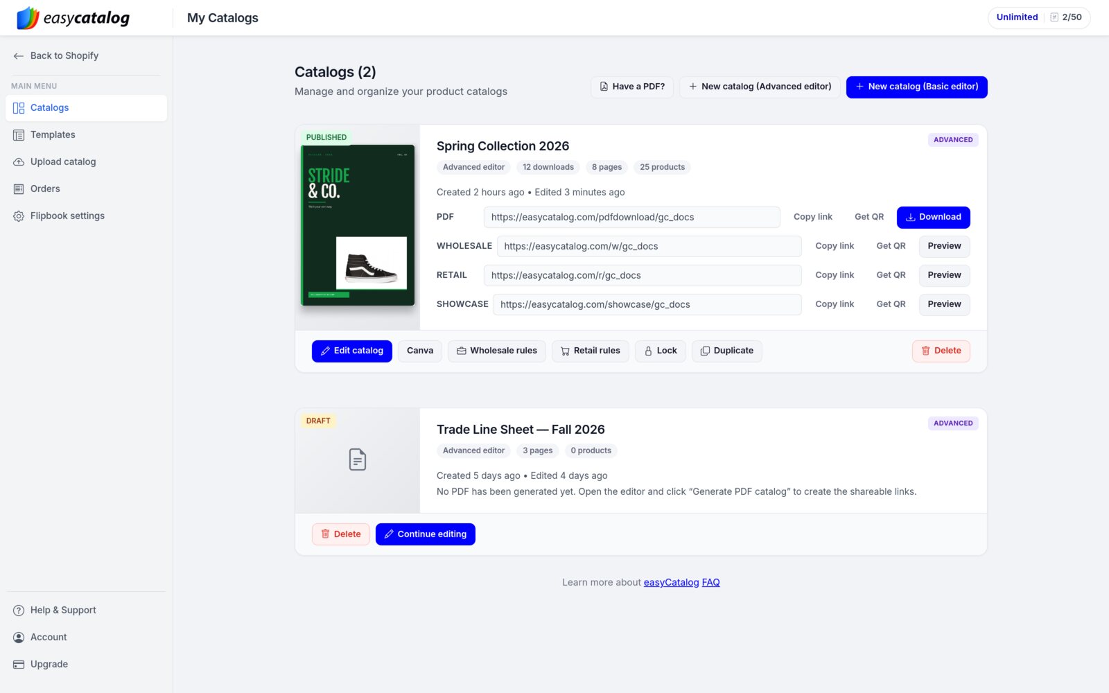
| Link | What opens | Good for |
|---|---|---|
| The PDF file itself. | Email attachments, printing, archiving. | |
| Wholesale | A flipbook with an order form. Buyers pick quantities for each variant and send you the order. | Trade buyers, sales reps, B2B customers. |
| Retail | A flipbook whose cart goes to your Shopify checkout. Shopify stores only. | Shoppers, newsletters. |
| Showcase | A browse-only flipbook, with no cart. | Social media, press, retail partners. |
Catalog actions
- Edit catalog reopens the editor. After changes, save and click Generate PDF catalog again. Your share links stay the same and show the new PDF once it's ready.
- Canva (Shopify stores on PRO, Unlimited or Enterprise) imports your PDF into your Canva account, so you can edit it there.
- Wholesale rules sets the rules for the Wholesale order form (below).
- Retail rules (Shopify) adds a discount code and a cart note to the checkout, and chooses what the retail order form shows.
- Lock puts a password on the public links. Visitors need it to view the catalog. Leave the password empty to remove it.
- Duplicate makes a draft copy, for example to start next season's catalog. Open the copy in the editor to generate its PDF.
- Delete removes the catalog for good.
Wholesale rules
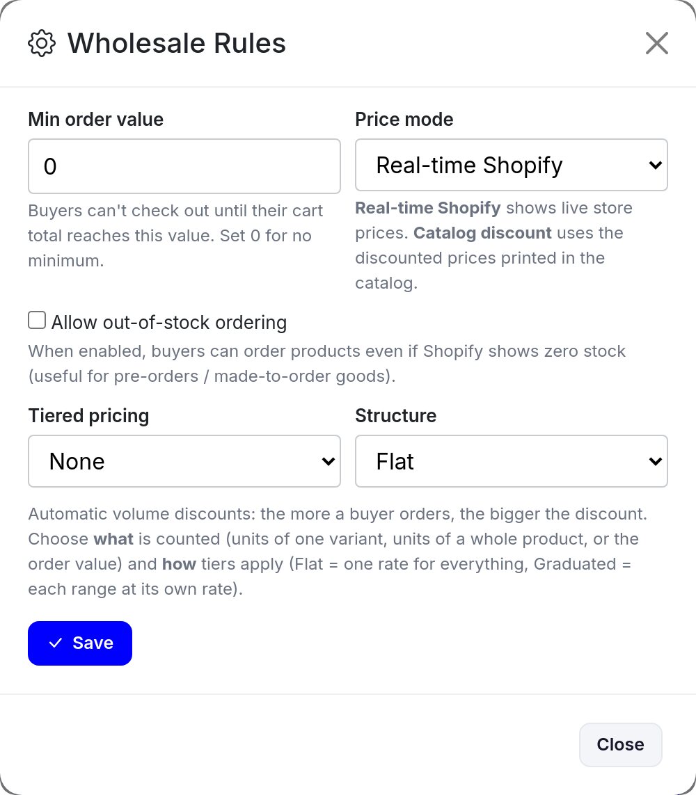
- Min order value: buyers can't check out until their cart reaches it. Set 0 for no minimum.
- Price mode: Real-time Shopify uses your live store prices. Catalog discount uses the discounted prices printed in the catalog. (Accounts without Shopify see Current inventory prices, the prices on your Inventory page, instead.)
- Allow out-of-stock ordering: useful for pre-orders and made-to-order goods.
- Tiered pricing: automatic volume discounts by variant quantity, product quantity or order value. Structure sets Flat (one rate for everything) or Graduated (each range at its own rate).
Click Save to apply the rules to the live order form.
Step 12
What your buyers see
The Wholesale link opens your catalog as a flipbook. Buyers turn pages with the arrows, and the toolbar at the bottom lets them jump between pages, zoom and search. The Checkout button in the corner counts the items in their cart.
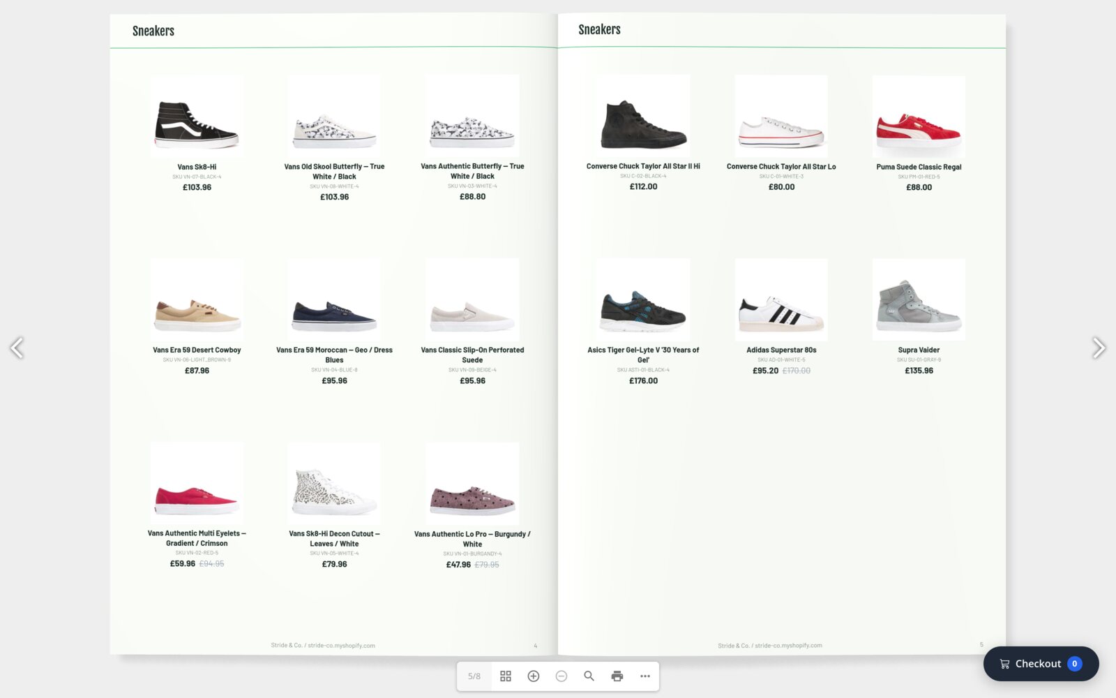
A buyer clicks a product to open it. Each variant, such as each shoe size, has its own price and quantity box. They set quantities and click Done. The Checkout button in the corner opens the cart, which lists every line with a total. Checkout → then asks for the buyer's details (name, company and email are required). They click Confirm & Submit, and you receive the order.
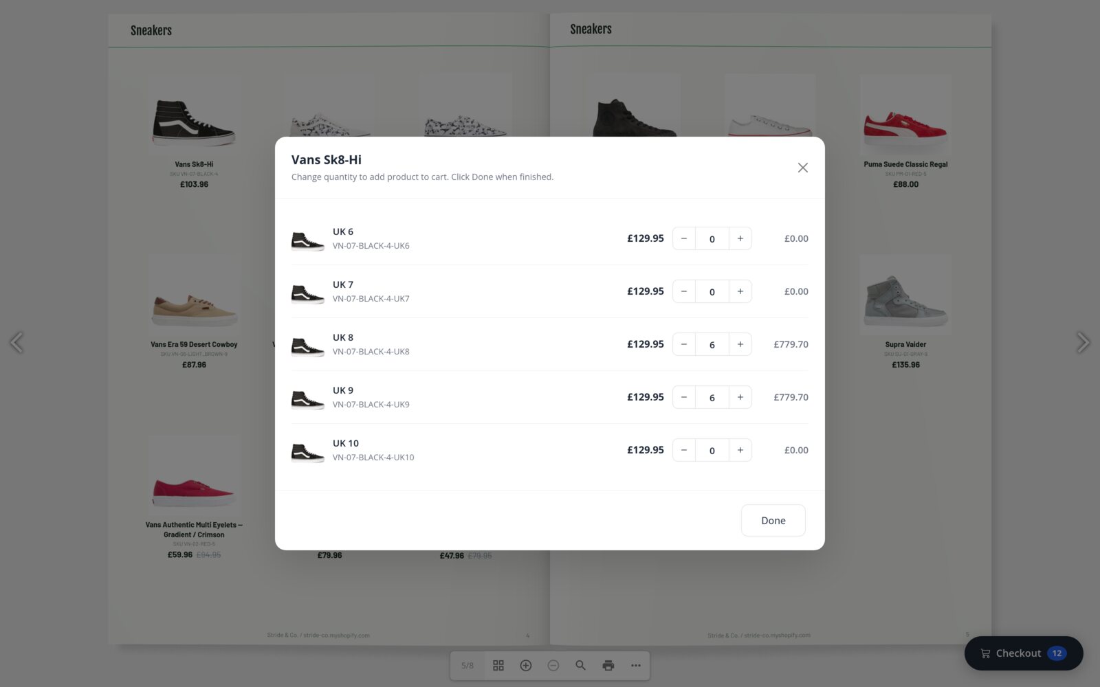
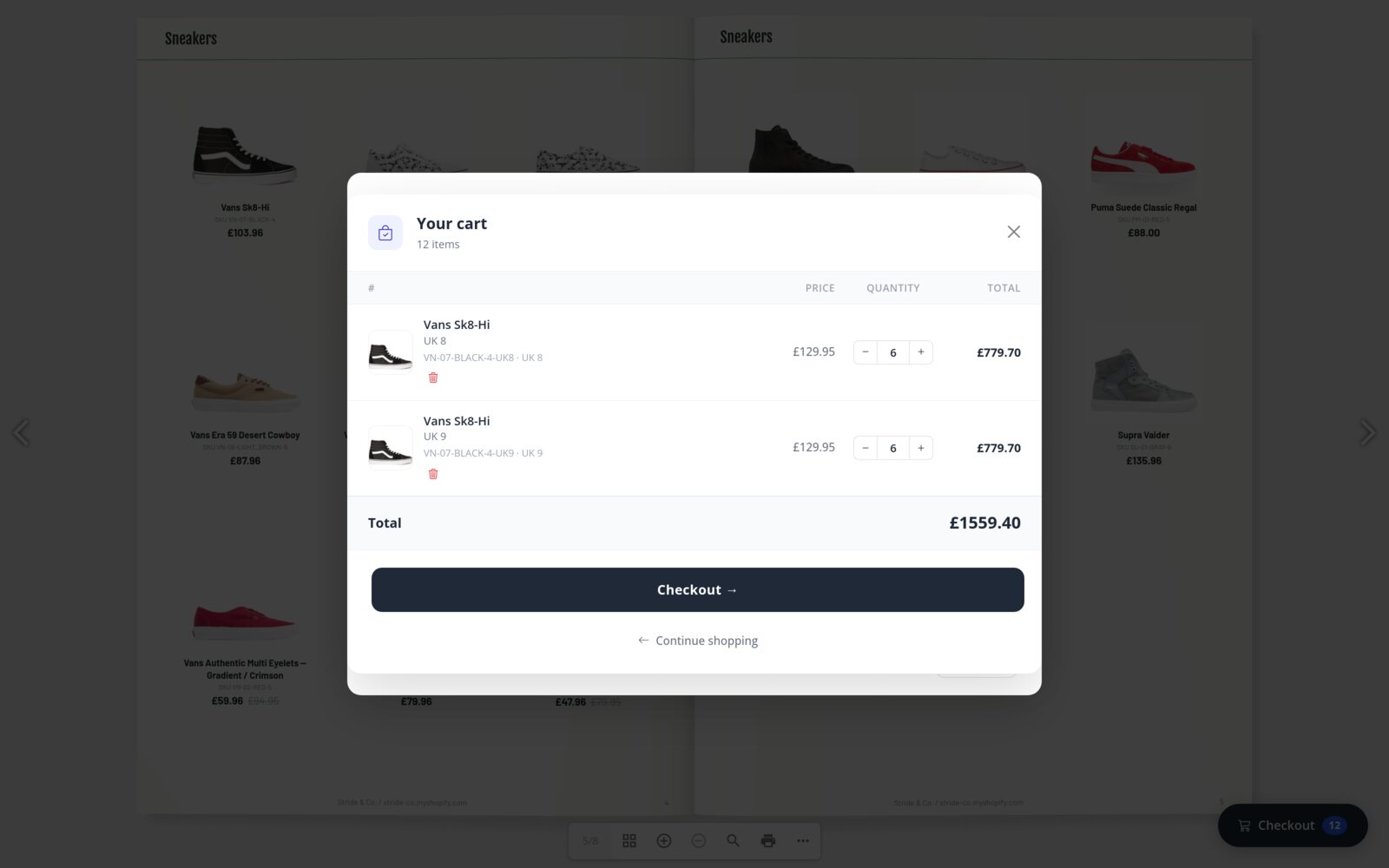
Which price does the order form use?By default, the order form uses your live store prices. That's why the product window shows £129.95 while the page prints the discounted £103.96. To use the catalog's discounted prices, set Price mode to Catalog discount in Wholesale rules.
The Retail link looks the same, but its cart hands over to your Shopify checkout. The Showcase link has no cart at all: it's for browsing.
Help
Tips and troubleshooting
Ask AI: answers with screenshots, right in the editor
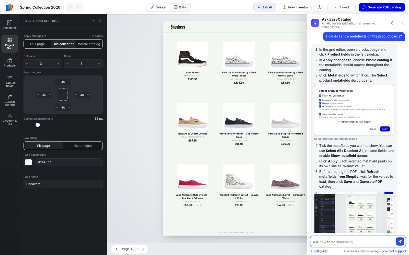
Stuck? Click Ask AI in the top bar. A panel opens on the right. Type your question in your own words, in any language, and the assistant answers with the exact buttons to click and screenshots of the right screen. It knows which panel you have open, so "how do I hide this?" works too. Click a screenshot to see it full size.
If an answer doesn't solve it, click contact support at the bottom of the panel: the conversation goes to our team and we reply by email. The assistant can explain, but it can't change your catalog for you.
I don't see my changes in the PDF or on my share links.
The PDF is a snapshot from the moment you generated it. Save your changes, then click Generate PDF catalog again. Your links stay the same and show the new version once it's ready.
Where did the Pages sidebar go?
It's on the right side of the editor. If you only see a spreadsheet, you're in Data view: click Design in the top bar.
The secondary panel disappeared.
It's folded away. Click any icon in the left sidebar, or anything on the page, to bring it back.
Can I change a product's title or price without touching Shopify?
Yes. Use Data view. Edits there change this catalog only, and they're kept when you Sync.
How do I get back an earlier design?
For a recent change, press Undo (Ctrl + Z). For an earlier save, click the clock icon and use Version history.
My products don't fit, or there are gaps.
Products that don't fit flow onto the next page, so nothing is lost. To pack more onto a page, raise Columns or Rows in Page & Grid. To close gaps, click Reflow in the Added products tab.
I clicked a product and it went to the start of the page.
That's how a plain click works. To choose the spot, click an empty + cell first, then the product. Or drag the product onto the cell you want.
How do I take one product out?
Click it on the page and press Delete, or click the × on the card or on its row in Added products. The other products don't move up by themselves. Click Reflow to close the gap.
The order form shows a different price than the catalog.
The Wholesale order form uses your live store prices by default. Switch Price mode to Catalog discount in Wholesale rules to use the printed prices.
Ready to build yours?
Install EasyCatalog on your Shopify store, or start a 7-day free trial without a store and add your products from a file.