Minimal catalog template for a calm, always-in-stock range
A 15-page wholesale catalog with lots of white space, thin type and neutral photography, for brands whose range stays the same all year. The sample is a fictional maker of everyday ceramics and linen sold by the case.
Free plan available — all templates are included on every plan. Already have an account? Open it in Templates.


All 15 designed pages
Covers, promotion and product-story pages built for this campaign. Use the ones you need; your product pages are added in the same style.


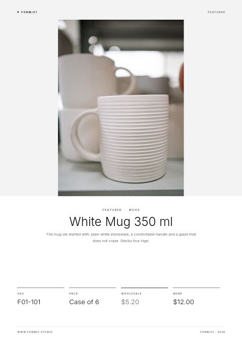


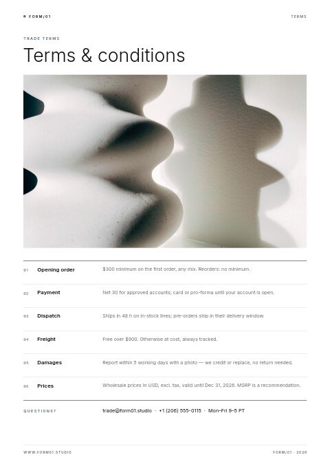


Product pages that fill themselves
Import your products and they take this layout automatically — shown here with sample products. Switch the grid any time, from 2 × 2 to 4 × 5 or a one-column line sheet.

About the Minimal Catalog template
Most of this minimal catalog template is white space. Inter in light weights, a single slate-blue accent and thin rules frame neutral photos of stoneware, linen and dried grasses. The front cover keeps the title small beside a white wavy vase on gray; the poster cover puts “Less.” and one line on a card over a beige ring vase, and the section divider pairs a large, thin slate-blue number with one photo.
A quiet layout suits products that sell on quality rather than novelty. The sample copy for a fictional ceramics studio speaks to buyers who restock the same lines all year: forty pieces, no seasonal drops, one price list, dispatch in 48 hours and volume pricing by the case. Bring products in from Shopify, WooCommerce or a CSV and they land on white product pages with plenty of room around each photo. Share a wholesale flipbook with tiered pricing, or print the PDF as a reference copy for buyers.
Best for
- Ceramics, glassware and linen brands with a year-round core range
- Always-in-stock programs sold by the case to cafés and shops
- Brands that want the product photos to do most of the talking
- Wholesalers offering volume discounts at set case quantities
- Studios with a neutral, understated brand look
Pages worth a closer look
One-word poster cover
A large photo of a beige ring vase fills the page, with a small white card that says “Less.” and one line about the range. It works as a flipbook opener or a social image when you want the product to speak for itself.
Founder's note with three steady figures
A tall photo of stacked plates sits beside a short note on why the range does not change, signed by the founder. Three figures back up the promise: forty lines always in stock, zero seasonal drops and 48-hour dispatch.
Volume pricing in slate blue
A slate-blue block holds a thin −8% and the line “Order more, pay less per case,” with a round photo and three rules: 8% off at ten cases, 12% at twenty-five, all year. EasyCatalog's tiered volume pricing supports up to three tiers.
Quiet shelves lookbook
Three photos, bowls stacked in rows, a eucalyptus stem in a small vase and cups on a shelf, show the range on display. Consistent, neutral styling helps buyers picture the pieces in their own store.
How to present a core range in a minimal catalog
Photograph every product the same way
Minimal layouts expose any inconsistency. Shoot every product on the same background, from the same angle and in the same light. If your current photos vary, reshoot the best sellers first and use styled shots only on the cover, dividers and lookbook.
List the details that matter in daily use
For tableware, buyers ask about capacity in ml and oz, dimensions, whether pieces stack, and whether they are dishwasher, microwave and oven safe. Put these in one short line under each product. Cafés and restaurants also want to know how long each line will stay available.
Make continuity the selling point
For a core range, availability matters as much as price. State lead times, how long lines stay in production and how you announce discontinued items. Buyers build permanent displays around products they can reorder for years, so say clearly that they can.
Use fewer words, not smaller ones
A minimal catalog still needs facts. Cut adjectives instead of shrinking the type: one sentence per product, specs in the same order every time and plenty of space around the photo. For print, keep body text at a readable 9 to 11 points.
From product list to finished catalog
Pick this template
Open Minimal Catalog in EasyCatalog and choose the cover and the pages you want — every page is optional and editable.
Add your products
Import from Shopify in one click, or upload a CSV, connect WooCommerce or a product feed. Your products fill the product pages automatically.
Download or share
Export a print-ready PDF (up to 300 DPI, CMYK and bleed for print shops) or share an online flipbook with a built-in order form.
Questions about this template
What does the Minimal Catalog template include?
Fifteen pages: a white front cover with a wavy vase, a band cover with a still life and contents, a “Less.” poster, a founder's note, contents, a cups divider, a centered featured mug, an essentials page of six products, volume pricing, how to order, trade terms, contact, a framed blank page, a black back cover and a quiet-shelves lookbook.
Can I keep the minimal look with my own brand colors?
Yes. Every color, font and photo can be changed. The design relies on one accent color, so replace the slate blue with your brand color wherever it appears, choose fonts from 112 Google Fonts and 7 system fonts, and swap photos with Replace photo. One accent and generous white space are what keep the look minimal.
What makes a catalog design feel minimal?
Generous white space, one or two typefaces, a single accent color and consistent photos on plain backgrounds. With fewer elements on each page, every one has to earn its place, so cut decorative extras before product facts. A strict grid keeps pages calm even when they carry a lot of information.
Is a minimal catalog a good fit for wholesale buyers?
Often, yes. Buyers scan for price, pack size and availability, and a clean page with consistent placement makes those easy to find. It suits ranges with strong photos and simple specs; for products with long technical data, one-column line-sheet rows keep the specs readable.



Start your Minimal Catalog
Pick this template, add your products and download a print-ready PDF or share an online flipbook. Free plan available, no card needed.