Minimal Mono: a black and white catalog template with bold type
Minimal Mono is a black and white catalog template with flush-left Montserrat Extra Bold headlines and lots of white space, for brands whose products and photos should do the talking.
Free plan available — all templates are included on every plan. Already have an account? Open it in Templates.



All 7 pages
Cover, welcome letter, contents, how-to-order terms, a section divider, a wholesale order form and a back cover. Your product pages are added between them in the same fonts and colors.



About the Minimal Mono template
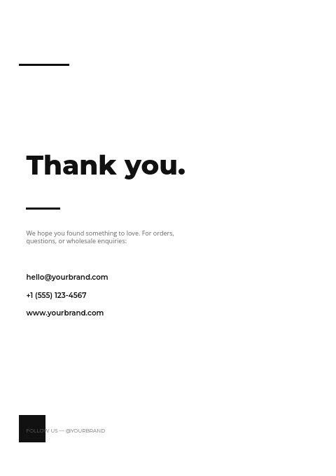
Minimal Mono is a black and white catalog template with an editorial attitude. Headlines are set flush left in Montserrat Extra Bold, the cover title ends with a full stop, and short black bars mark the start of each page. A solid black square anchors the cover and back page, contents rows sit on full-width rules, and Open Sans keeps the small text clean. There are no ornaments, only type, line and white space.
Because the layout has no color of its own, your product photography carries the whole catalog, which suits design-led goods with consistent studio shots. Products import into grids from 2×2 to 4×5 or into one-column line-sheet rows, with SKU, price, variant and barcode fields where you need them. Export a sharp PDF for print, or send the wholesale flipbook link, password-protected if the prices are for trade buyers only.
Best for
- Design-led brands whose product photos should be the only color
- Furniture, lighting and homeware makers with consistent studio shots
- Basics, streetwear and accessories labels that want a sharp wholesale catalog
- Hardware, fixture and tool suppliers who prefer a sober, technical feel
- Teams that print catalogs on office printers and need strong contrast
Pages worth a closer look
An oversized title that ends in a full stop
PRODUCT CATALOG. runs large across the middle of the cover in Montserrat Extra Bold, flush left, with the edition line beneath it. A black square in the bottom corner and a short bar under your brand name are the only graphic elements.
Contents in heavy capitals on full-width rules
Section names such as NEW ARRIVALS, BEST SELLERS and SALE & OFFERS run in bold capitals across full-width black rules, with small page numbers at the right edge. The page works like a table, so a buyer can scan it in seconds.
A giant gray numeral for every collection
Each section opens with a huge light-gray 01, the line COLLECTION Nº 01, a bold collection name and a two-line introduction. Add a divider for every range you carry and the catalog gains rhythm without a single extra color.
An order form with a solid black header row
The item table starts with a black bar reading ITEM / SKU, DESCRIPTION, QTY, UNIT PRICE and TOTAL, below fields for company, contact, PO number and ship-to address. Pure black and white keeps it legible on an office printer or a phone scan.
How to make a black and white catalog work for your products
Let the photos be the only color
In a monochrome layout, every product photo becomes the point of color on the page. That only works when the photos agree with each other: same background, same light, same white balance. Reshoot the two or three outliers rather than letting them break an otherwise clean grid.
Crop every product the same way
Pick one framing rule, for example the product fills most of the frame, centered and shot straight on, and apply it to the whole range. On white pages, uneven margins and mismatched shadows are the first thing a buyer notices, long before the type.
Build hierarchy with weight and size
Without color to separate information, type does the work. Use Extra Bold for page titles, a medium weight for product names, regular for descriptions and small capitals for SKUs. Three or four sizes are plenty; more starts to look accidental rather than designed.
Check pale grays on a printed proof
Very light tints, like the large 01 on the divider, can print unevenly or almost disappear on some presses and office printers. Check them on a printed proof and darken a tint slightly if it fades. On screen and in the flipbook they appear as designed.
Write product copy as tight as the layout
A spare design exposes long, loose descriptions. Give each item one line on what it is and why it matters, then the facts buyers need: SKU, size, material, pack size and price. Save the brand story for the welcome page, where it has room to breathe.
From product list to finished catalog
Start with this set
Open Minimal Mono in EasyCatalog and recolor it with one of 12 palettes if you like.
Add your products
Import from Shopify in one click, or upload a CSV, connect WooCommerce or a product feed. Your products fill the product pages automatically.
Download or share
Export a print-ready PDF (up to 300 DPI, CMYK and bleed for print shops) or share an online flipbook with a built-in order form.
Questions about this template
Can I add a brand color to the Minimal Mono template?
Yes. Recolor the set with any of the 12 palettes, or change individual colors yourself, for example a red price or a blue section title. A good middle ground is to keep the pages black and white and use your brand color only on the cover square and the order form header.
Will Minimal Mono print well on an office printer?
The layout is black, white and gray, so it holds up on a laser printer and in photocopies. Download the PDF in Letter, A4 or A5, portrait or landscape. For a print shop, choose the CMYK Print professional option and add 3 mm or 5 mm bleed with crop marks.
Why do minimalist catalogs use so much white space?
White space groups information and slows the eye down, so each product is looked at rather than skimmed. It also signals restraint, which suits design-led and premium goods. The trade-off is fewer products per page, so minimal catalogs often run longer or switch to line-sheet rows for basics.
Which fonts work best in a black and white catalog?
Pair one strong display face with one quiet text face. A geometric sans in a heavy weight, such as Montserrat Extra Bold, gives headlines presence without color, while a neutral sans like Open Sans stays readable at small sizes for SKUs and prices. Two families are usually enough.


Start your Minimal Mono catalog
Pick this template, add your products and download a print-ready PDF or share an online flipbook. Free plan available, no card needed.